3D立体卡片动效
- 欢迎关注:xssy5431 小拾岁月
- 参考链接:https://mp.weixin.qq.com/s/9xEjPAA38pRiIampxjXNKQ

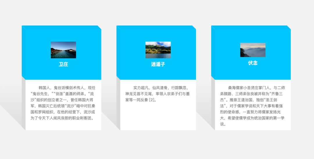
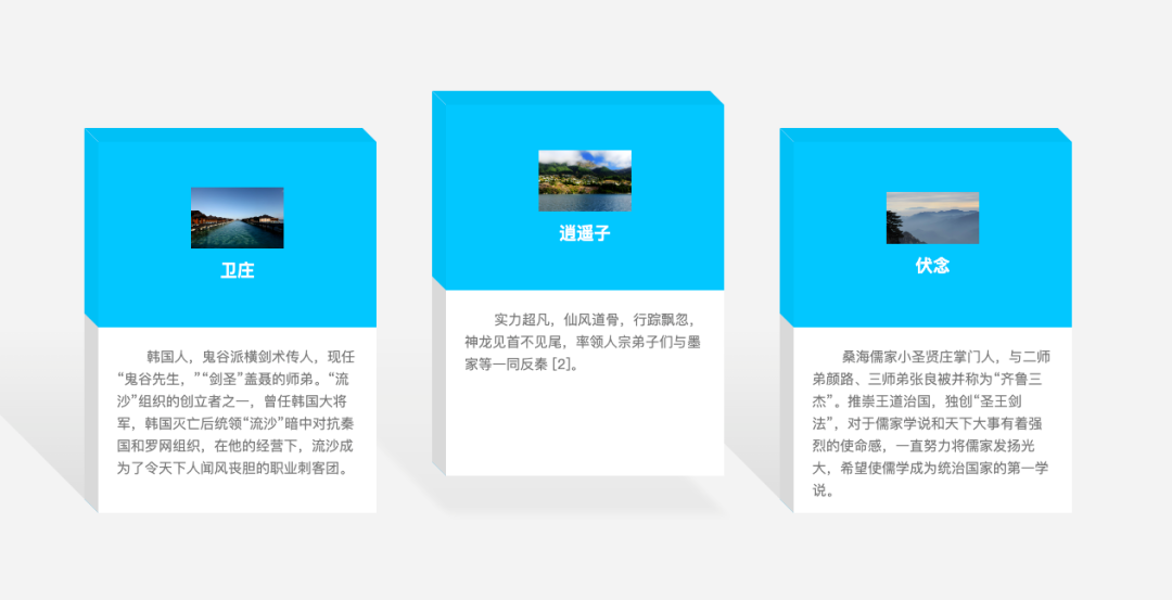
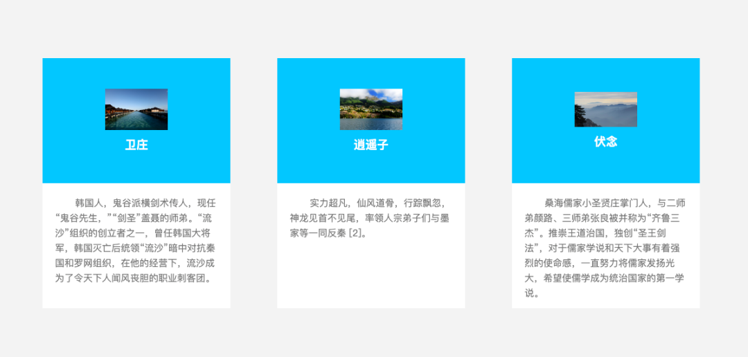
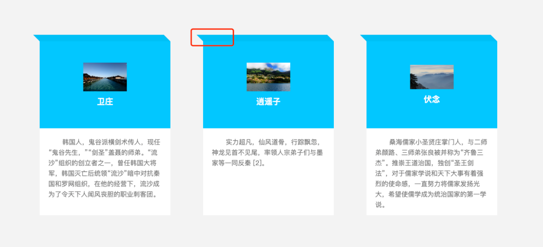
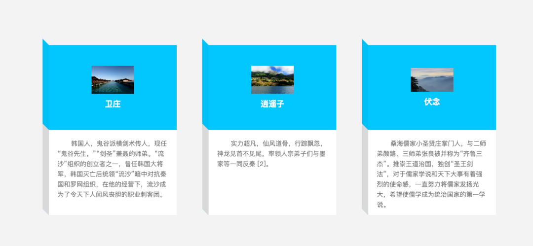
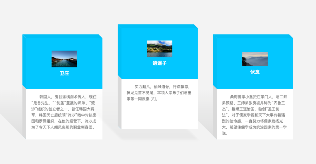
效果展示
思路分析
需求含有立体这种关键词,我们第一反应是采用动画中的平移、倾斜等实现。如果是立体,必然产生阴影,应用的处理采用滤镜处理。
页面布局
<div class="container">
	<div class="card">
		<div class="img_box">
			<img class="avatar" src="./img/1.jpg" alt="">
			<h3 class="name">卫庄</h3>
		</div>
		<div class="content">
			<p>韩国人,鬼谷派横剑术传人,现任“鬼谷先生,”“剑圣”盖聂的师弟。“流沙”组织的创立者之一,曾任韩国大将军,韩国灭亡后统领“流沙”暗中对抗秦国和罗网组织,在他的经营下,流沙成为了令天下人闻风丧胆的职业刺客团。</p>
		</div>
	</div>
	<div class="card">此处省略相同布局</div>
	<div class="card">此处省略相同布局</div>
</div>
1. 基础样式
* {
  margin: 0;
  padding: 0;
}

body {
  display: flex;
  justify-content: center;
  align-items: center;
  min-height: 100vh;
  background: #f3f3f3;
  overflow: hidden;
}

.container{
  position: relative;
  width: 1050px;
  display: flex;
  flex-wrap: wrap;
  justify-content: space-between;
  .card {
    position: relative;
    width: 300px;
    height: 400px;
    background: #fff;
    transition: 0.5s;
    .img_box {
      position: relative;
      width: 300px;
      height: 200px;
      background-color: #00c7ff;
      display: flex;
      flex-direction: column;
      justify-content: center;
      align-items: center;

      .name {
        position: relative;
        color: #ffffff;
        margin-top: 10px;
      }

      .avatar {
        max-width: 100px;
      }
    }

    .content {
      box-sizing: border-box;
      position: relative;
      width: 100%;
      height: 200px;
      padding: 20px;
      color: #777;
      background: #ffffff;

      .desc{
        text-indent: 2rem;
        font-size: 15px;
        line-height: 24px;
      }
    }
  }
}
2. 实现3D效果
2.1 顶面布局
card::before {
  content: "";
  position: absolute;
  top: -15px;
  left: 0;
  width: 100%;
  height: 15px;
  background-color: #00c0f6;
  transform-origin: bottom;
  transform: skewX(45deg);
  transition: 0.5s;
}
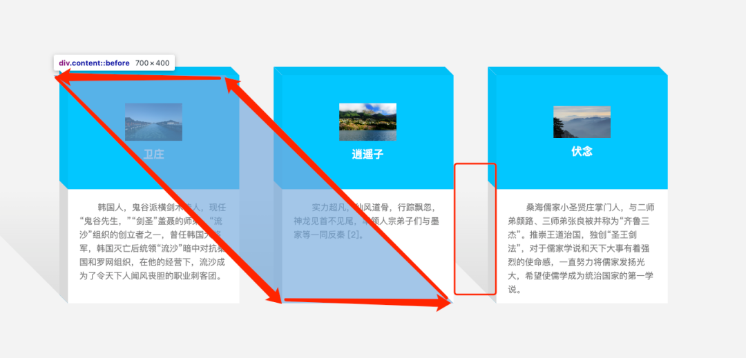
特别注意
- 为了实现 3D效果,我们可以采用 伪元素 的方式。
card::before用于制作卡片的 顶部切面;transform-origin: bottom;用于改变元素的 基点位置 ;transform: skewX(45deg);用于定义沿着 X 轴的 2D 倾斜转换;- 其中 top值 与 height值 要结合倾斜角度计算,或者通过控制台手动微调;
2.2 侧面布局
card::after {
  content: "";
  position: absolute;
  top: -15px;
  left: -15px;
  width: 15px;
  height: 50%;
  background-color: #00c0f6;
  transform-origin: left;
  transform: skewY(45deg);
  transition: 0.5s;
  border-bottom: 200px solid #d9d9d9;
}
特别注意
- 同上
- 思考:
height:50%;是怎么计算出来的;
组合效果
3. 阴影效果
.content::before {
  content: "";
  position: absolute;
  left: 0;
  bottom: 0;
  width: 100%;
  height: 400px;
  background: linear-gradient(transparent, transparent, rgba(0, 0, 0, 0.1));
  transform-origin: bottom;
  transform: skewX(45deg);
  transition: 0.5s;
  pointer-events: none;
  z-index: -1;
}
4. 鼠标移入效果
.card:hover {
  transform: translateY(-40px);

  .content {
    &::before {
      transform: translateY(40px) skewX(45deg);
      filter: blur(5px);
      opacity: 0.5;
    }
  }
}
5. 细节补充
.card:nth-child(1) {
  z-index: 3;
}

.card:nth-child(2) {
  z-index: 2;
}

.card:nth-child(3) {
  z-index: 1;
}
此处,处理定义的 层级问题,是为了处理 阴影的遮挡问题。
温馨提示
- 更多博文,请关注:xssy5431 小拾岁月,回复 “3D” ,获取源码;
本站资源均来自互联网,仅供研究学习,禁止违法使用和商用,产生法律纠纷本站概不负责!如果侵犯了您的权益请与我们联系!
转载请注明出处: 免费源码网-免费的源码资源网站 » 3D立体卡片动效(附源码)

发表评论 取消回复