rm -r dp203 -f
git clone https://github.com/MicrosoftLearning/Dp-203-azure-data-engineer dp203
cd dp203/Allfiles/labs/05
./setup.ps1
-
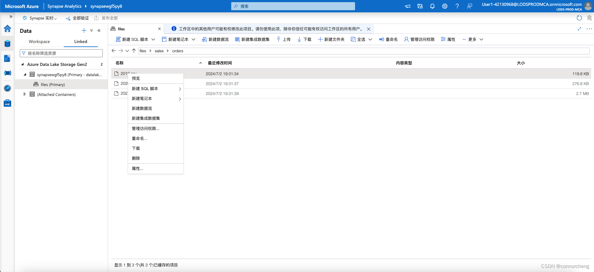
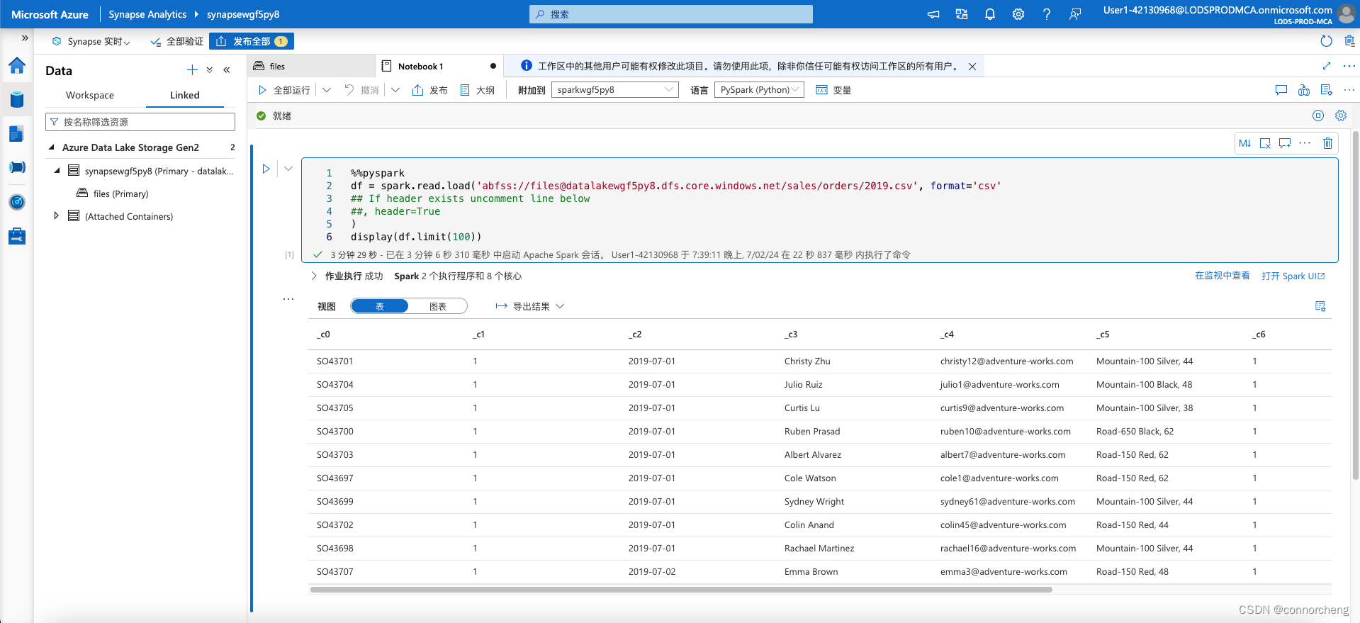
Select any of the files in the orders folder, and then in the New notebook list on the toolbar, select Load to DataFrame. A dataframe is a structure in Spark that represents a tabular dataset.
-
-
-
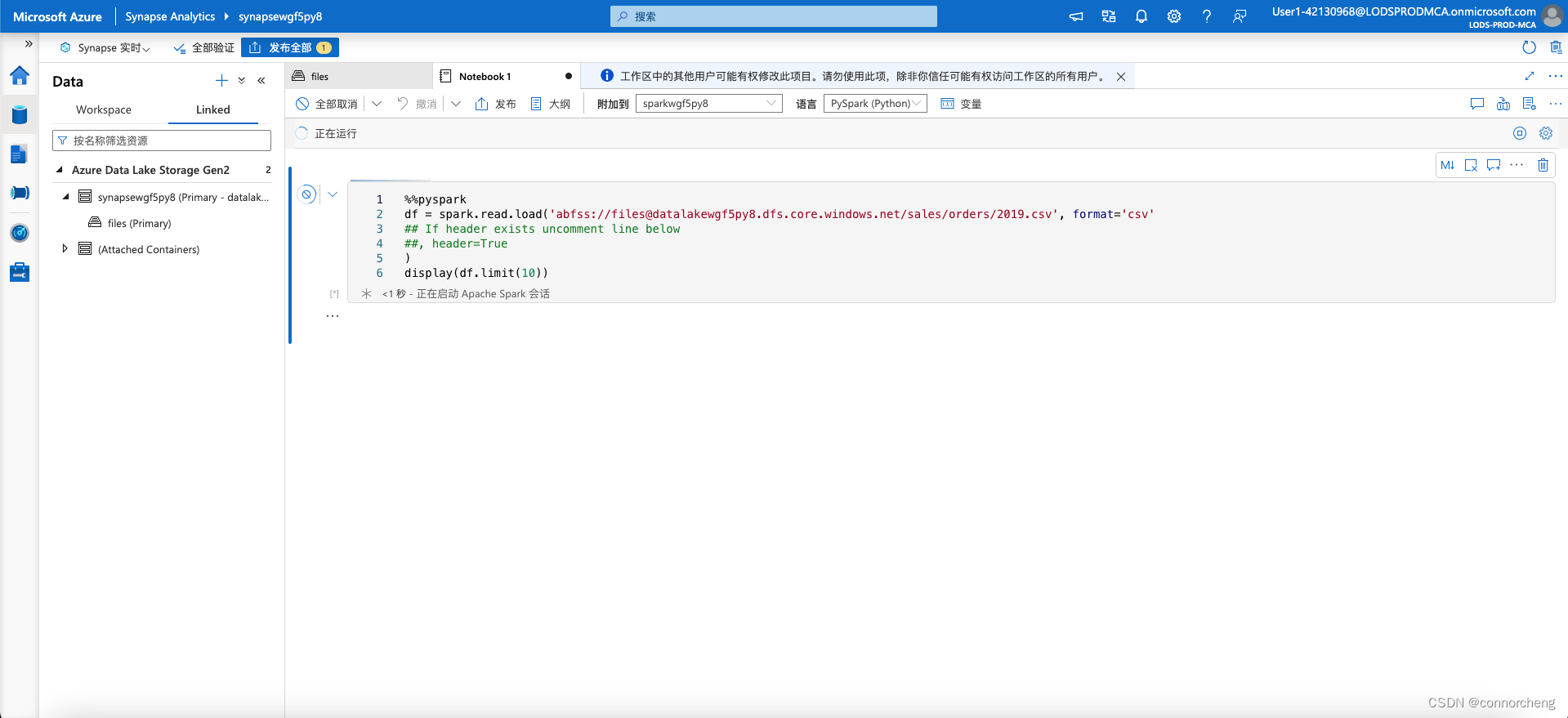
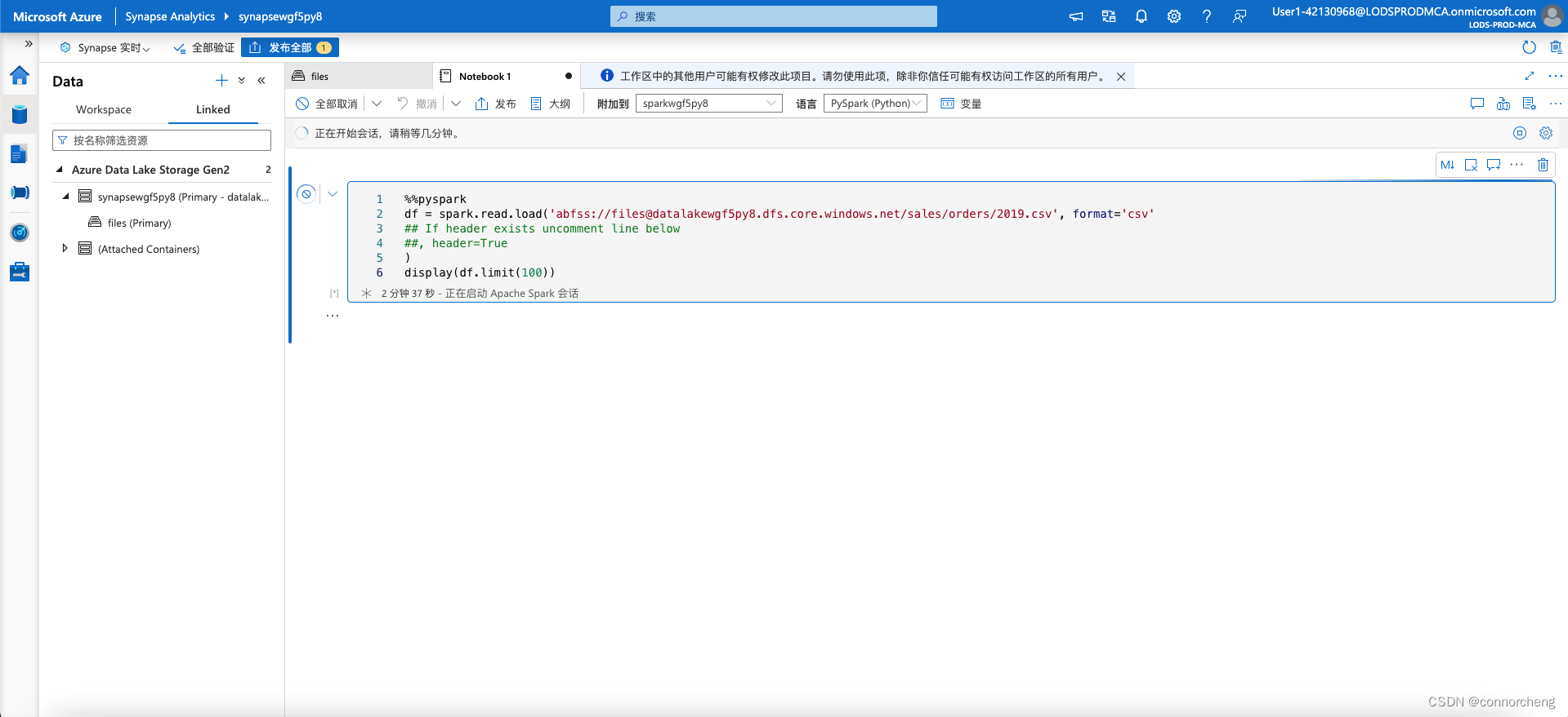
%%pyspark
df = spark.read.load('abfss://files@datalakexxxxxxx.dfs.core.windows.net/sales/orders/2019.csv', format='csv'
## If header exists uncomment line below
##, header=True
)
display(df.limit(10))
%%pyspark df = spark.read.load('abfss://files@datalakexxxxxxx.dfs.core.windows.net/sales/orders/*.csv', format='csv' ) display(df.limit(100)) -
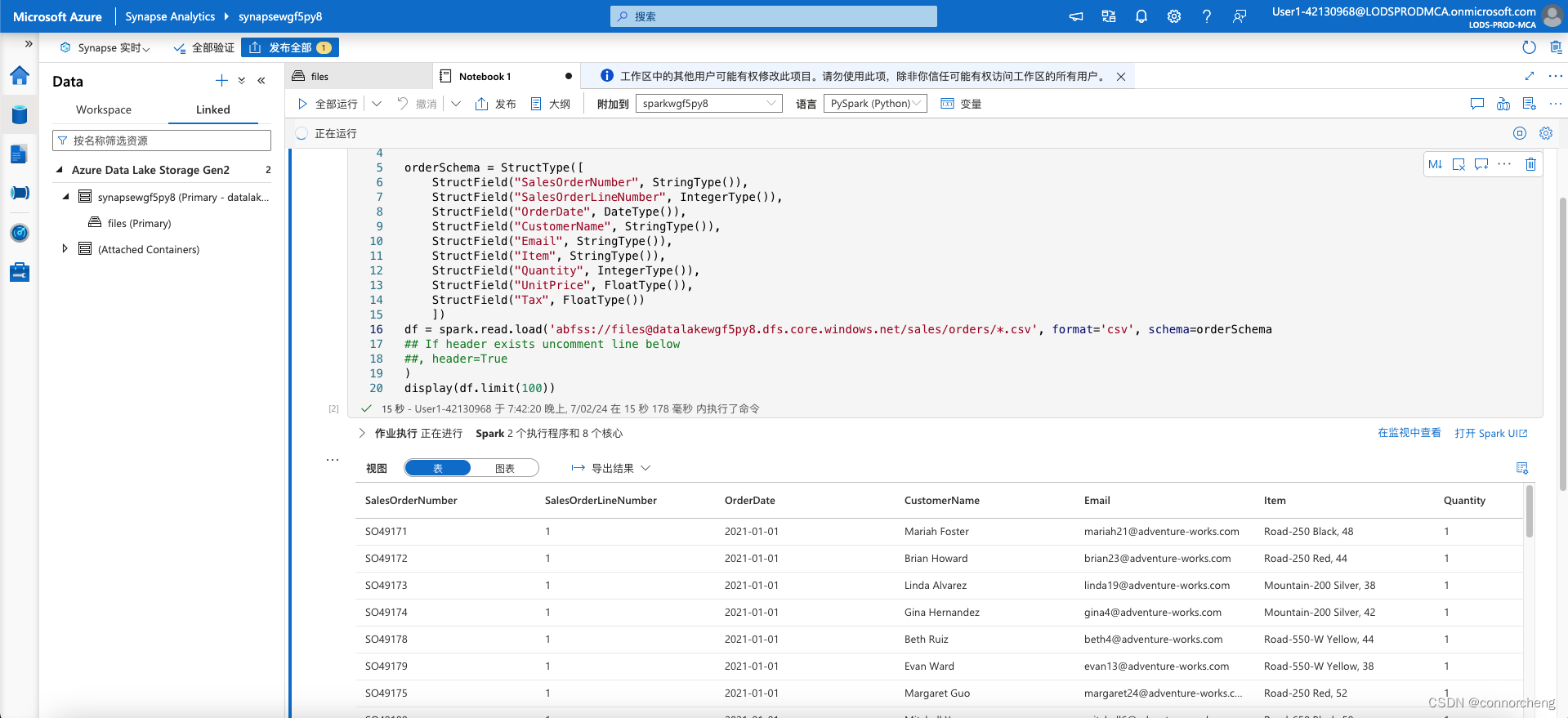
%%pyspark from pyspark.sql.types import * from pyspark.sql.functions import * orderSchema = StructType([ StructField("SalesOrderNumber", StringType()), StructField("SalesOrderLineNumber", IntegerType()), StructField("OrderDate", DateType()), StructField("CustomerName", StringType()), StructField("Email", StringType()), StructField("Item", StringType()), StructField("Quantity", IntegerType()), StructField("UnitPrice", FloatType()), StructField("Tax", FloatType()) ]) df = spark.read.load('abfss://files@datalakexxxxxxx.dfs.core.windows.net/sales/orders/*.csv', format='csv', schema=orderSchema) display(df.limit(100)) -
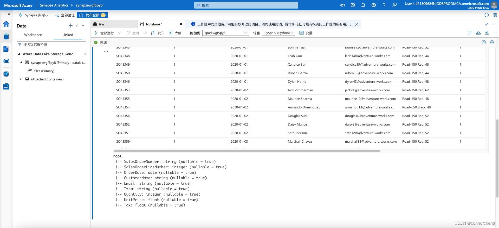
df.printSchema() -
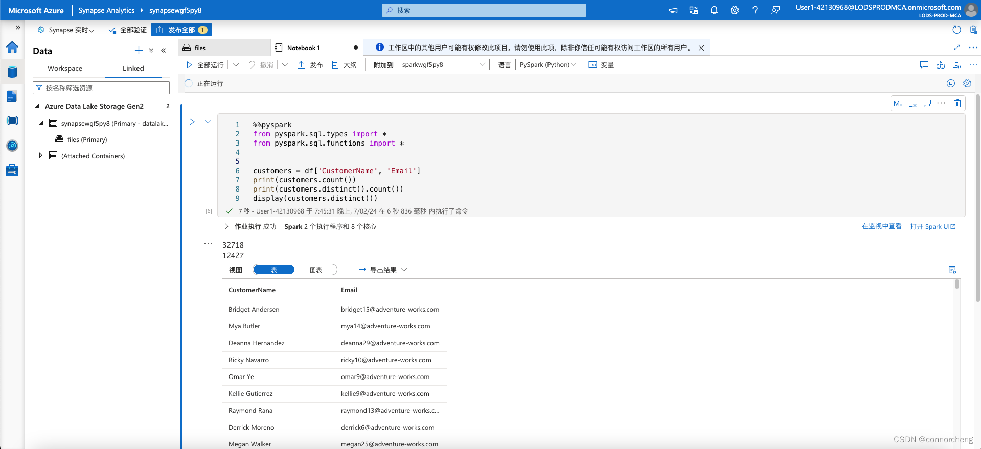
customers = df['CustomerName', 'Email'] print(customers.count()) print(customers.distinct().count()) display(customers.distinct()) -
Run the new code cell, and review the results. Observe the following details:
- When you perform an operation on a dataframe, the result is a new dataframe (in this case, a new customers dataframe is created by selecting a specific subset of columns from the df dataframe)
- Dataframes provide functions such as count and distinct that can be used to summarize and filter the data they contain.
- The
dataframe['Field1', 'Field2', ...]syntax is a shorthand way of defining a subset of column. You can also use select method, so the first line of the code above could be written ascustomers = df.select("CustomerName", "Email")
ustomers = df.select("CustomerName", "Email").where(df['Item']=='Road-250 Red, 52')
print(customers.count())
print(customers.distinct().count())
display(customers.distinct())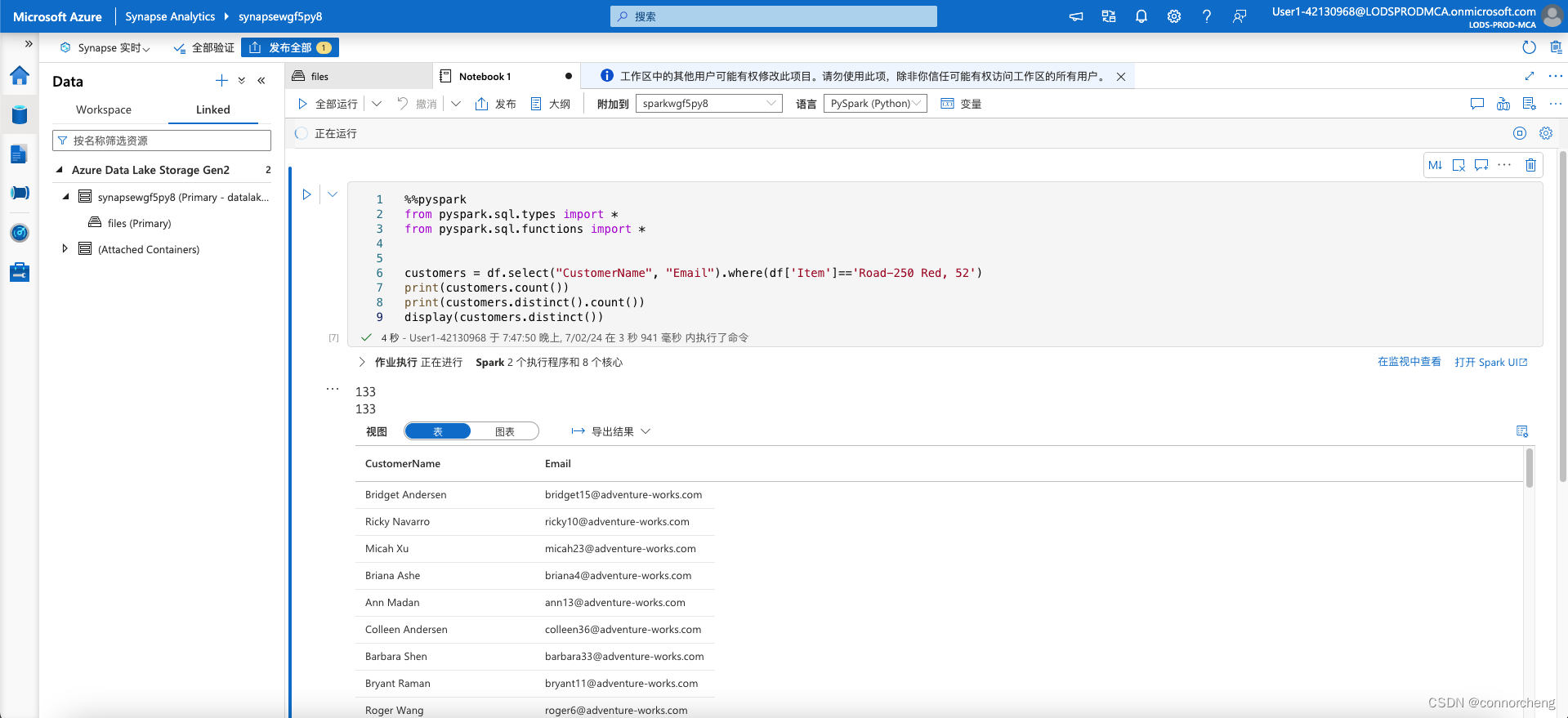
productSales = df.select("Item", "Quantity").groupBy("Item").sum()
display(productSales)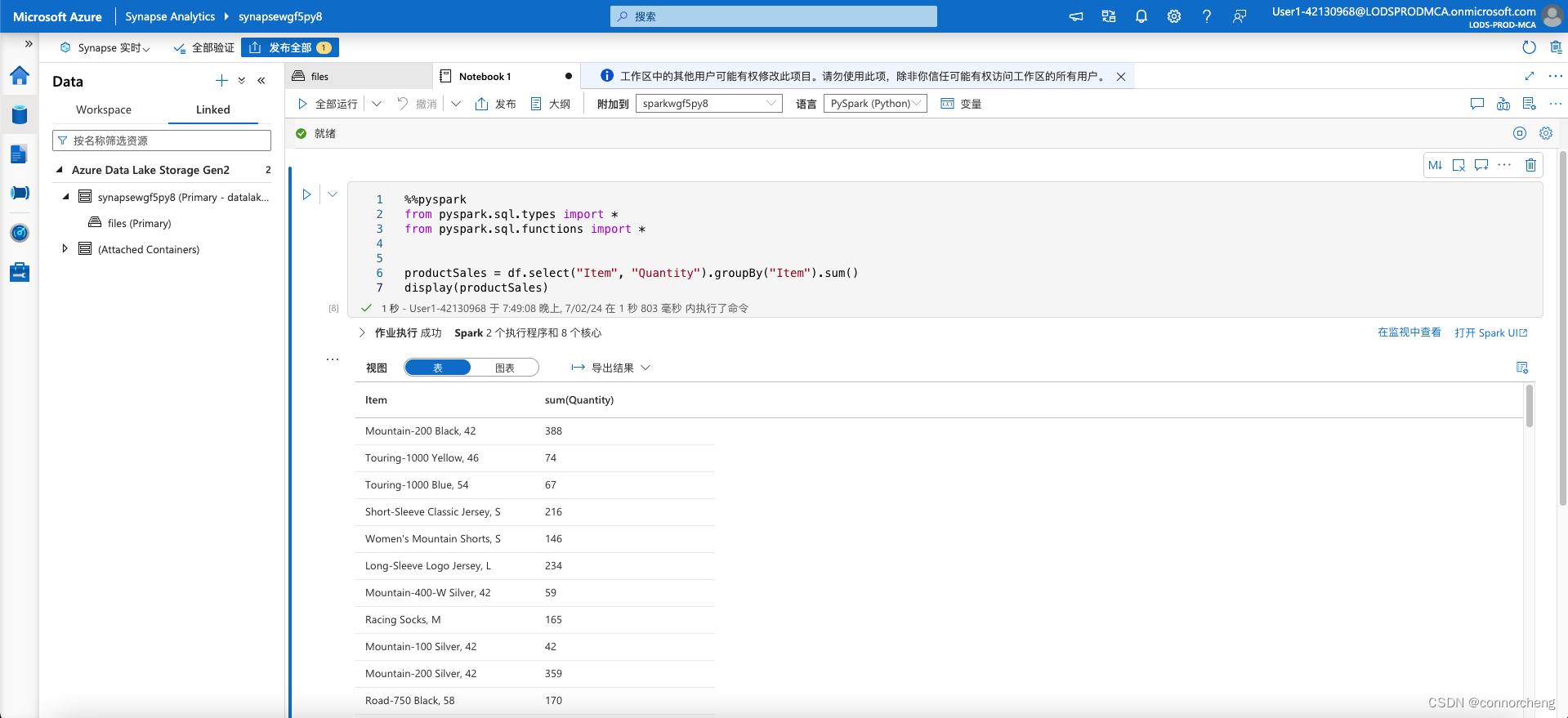
yearlySales = df.select(year("OrderDate").alias("Year")).groupBy("Year").count().orderBy("Year")
display(yearlySales)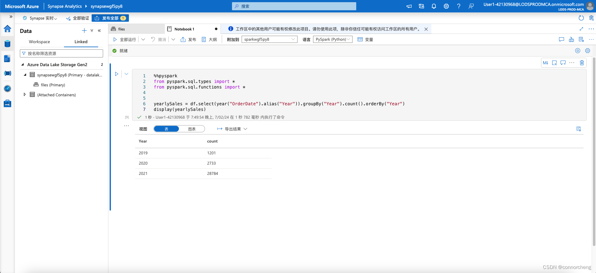
df.createOrReplaceTempView("salesorders")

spark_df = spark.sql("SELECT * FROM salesorders")
display(spark_df)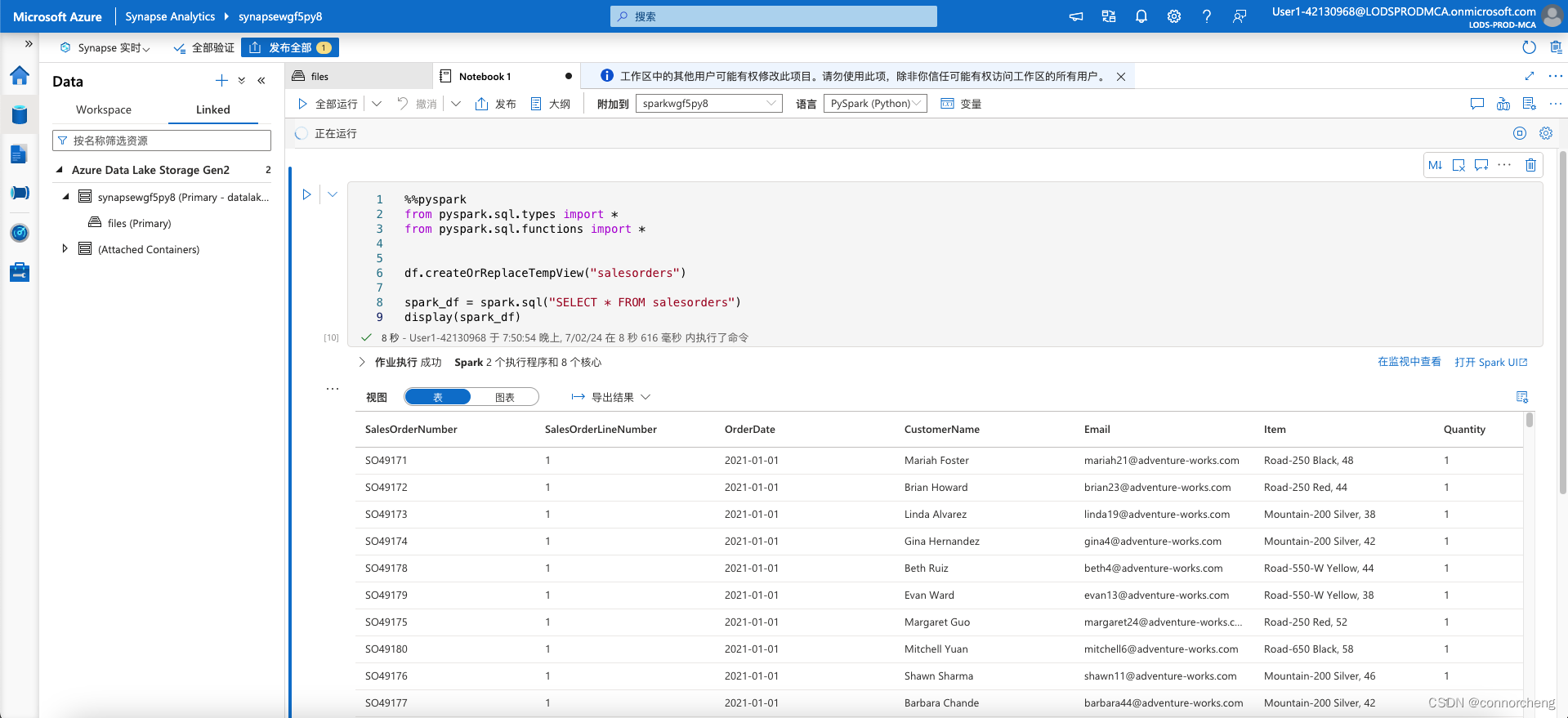
%%sql
SELECT YEAR(OrderDate) AS OrderYear,
       SUM((UnitPrice * Quantity) + Tax) AS GrossRevenue
FROM salesorders
GROUP BY YEAR(OrderDate)
ORDER BY OrderYear;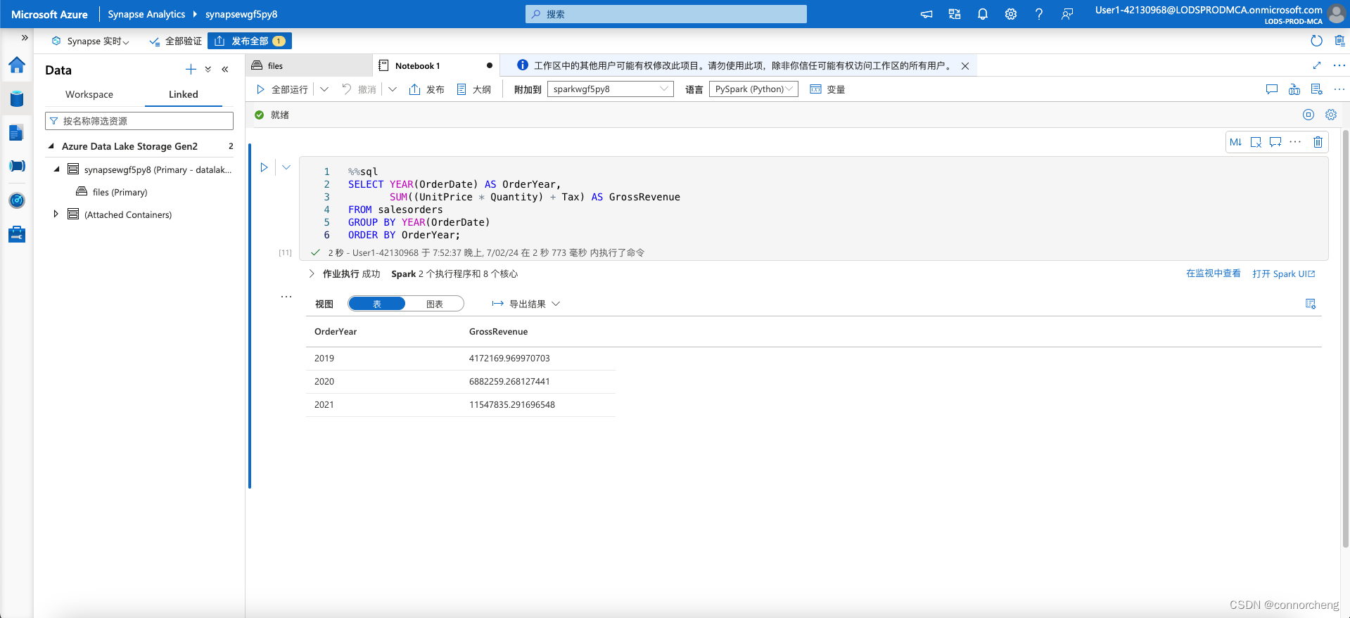
%%sql
SELECT * FROM salesorders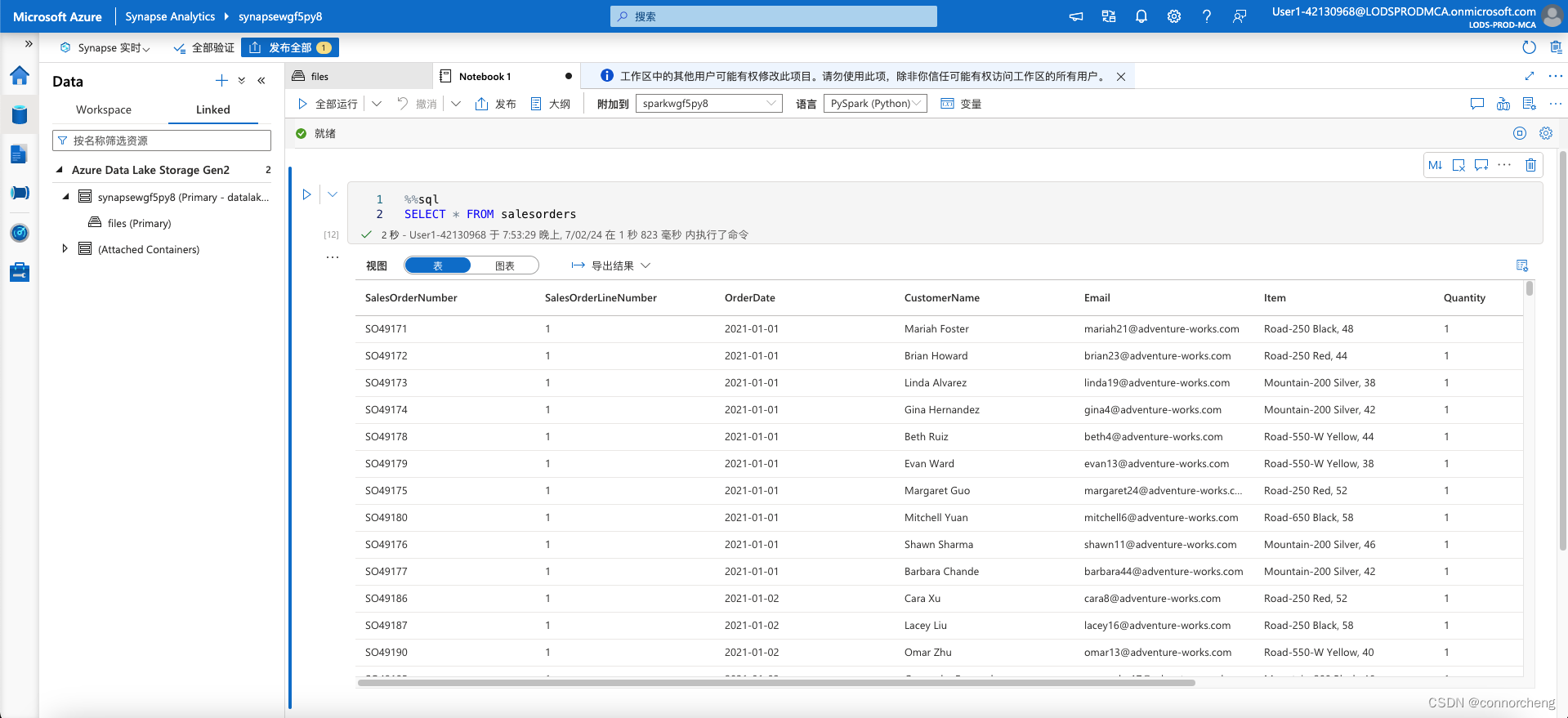
sqlQuery = "SELECT CAST(YEAR(OrderDate) AS CHAR(4)) AS OrderYear, \
                SUM((UnitPrice * Quantity) + Tax) AS GrossRevenue \
            FROM salesorders \
            GROUP BY CAST(YEAR(OrderDate) AS CHAR(4)) \
            ORDER BY OrderYear"
df_spark = spark.sql(sqlQuery)
df_spark.show()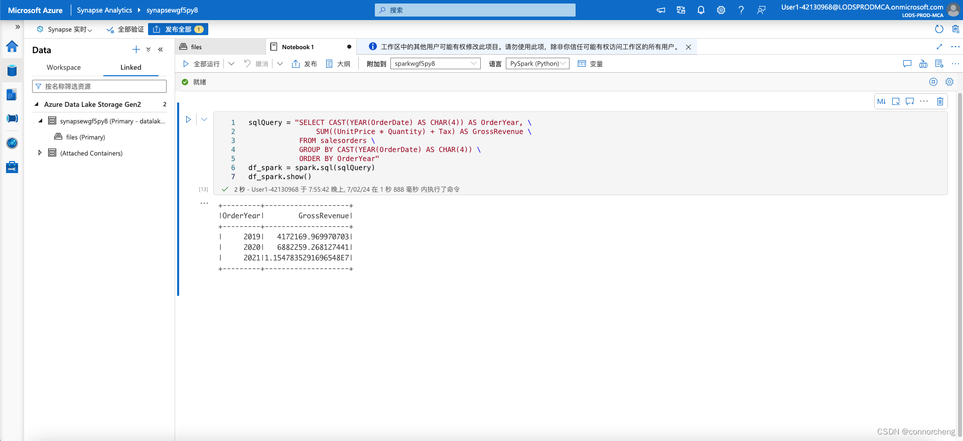
from matplotlib import pyplot as plt

# matplotlib requires a Pandas dataframe, not a Spark one
df_sales = df_spark.toPandas()

# Create a bar plot of revenue by year
plt.bar(x=df_sales['OrderYear'], height=df_sales['GrossRevenue'])

# Display the plot
plt.show()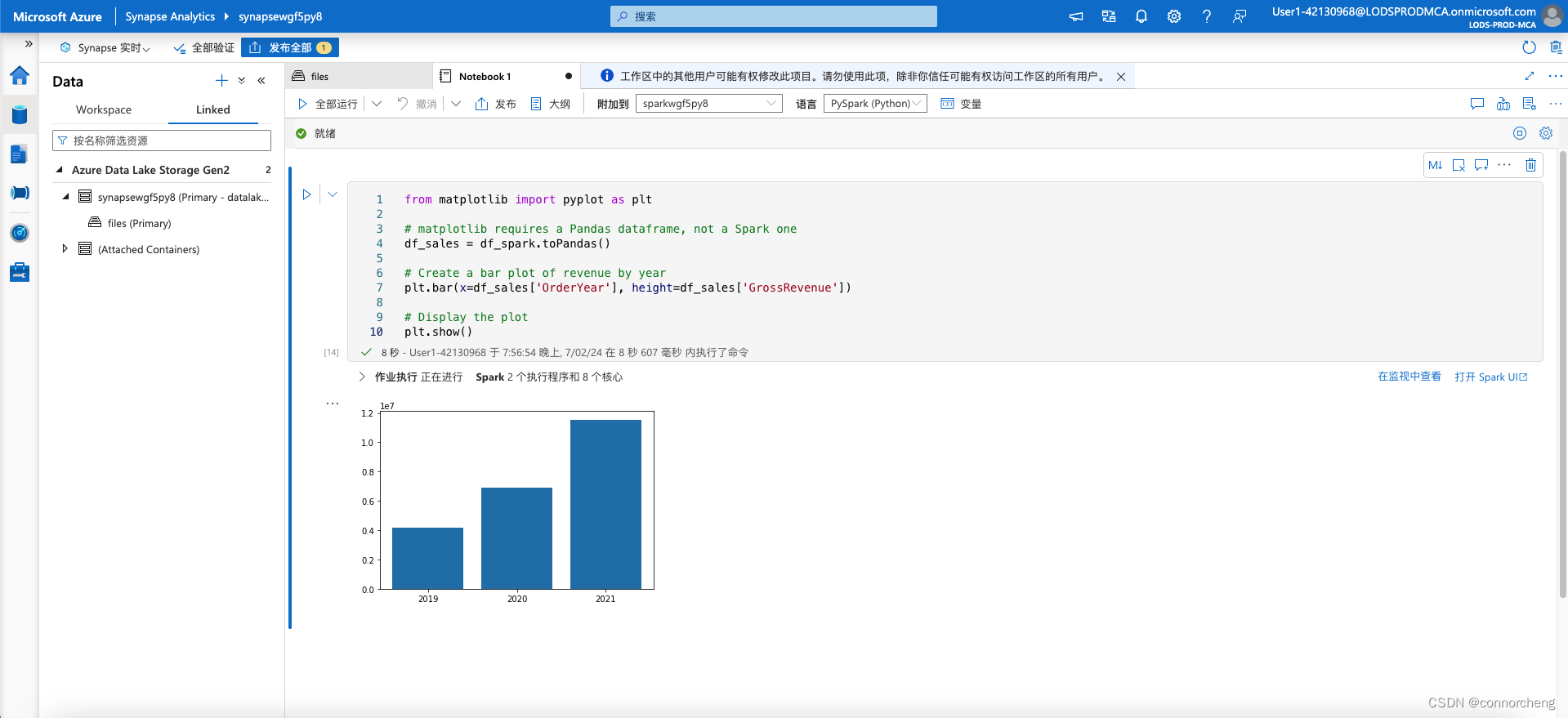
# Clear the plot area
plt.clf()

# Create a bar plot of revenue by year
plt.bar(x=df_sales['OrderYear'], height=df_sales['GrossRevenue'], color='orange')

# Customize the chart
plt.title('Revenue by Year')
plt.xlabel('Year')
plt.ylabel('Revenue')
plt.grid(color='#95a5a6', linestyle='--', linewidth=2, axis='y', alpha=0.7)
plt.xticks(rotation=45)

# Show the figure
plt.show()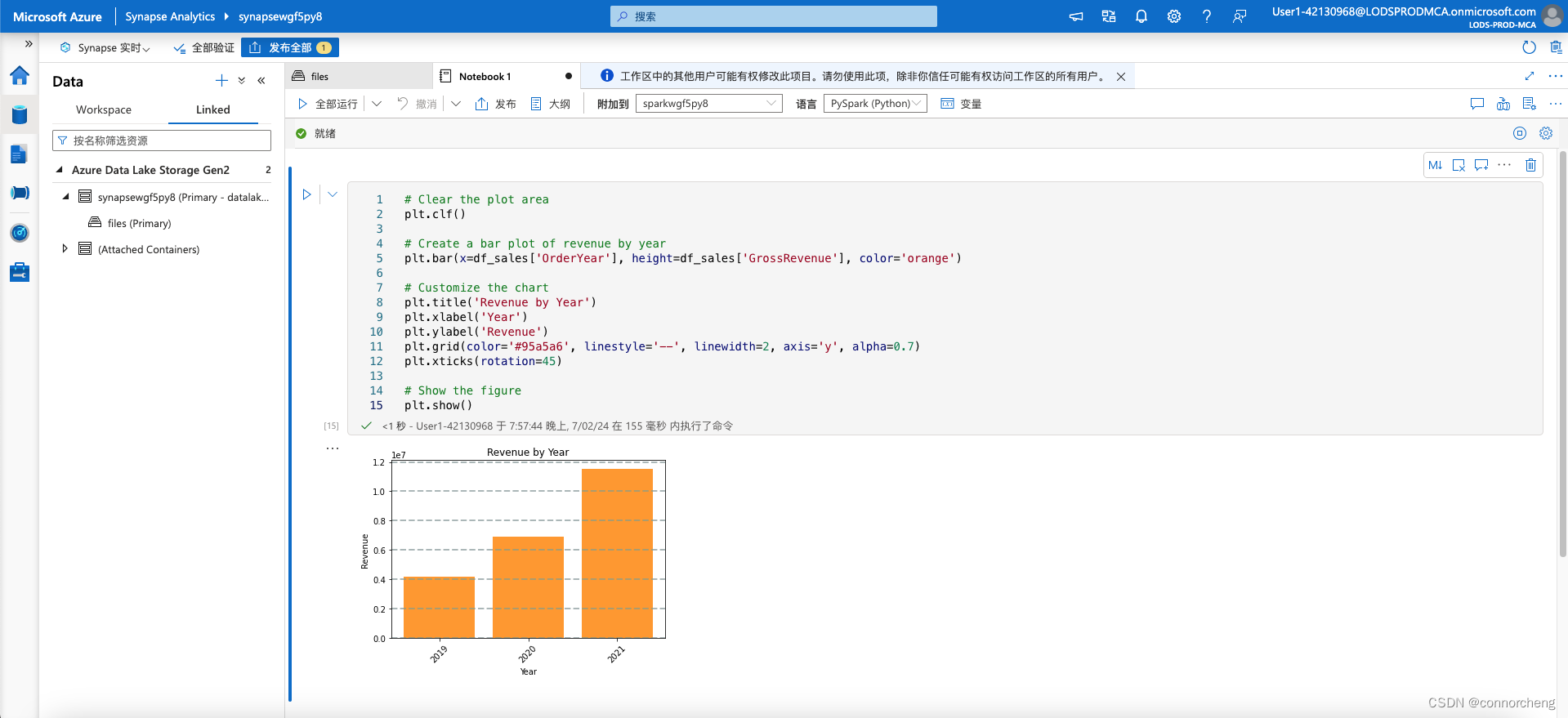
# Clear the plot area
plt.clf()

# Create a Figure
fig = plt.figure(figsize=(8,3))

# Create a bar plot of revenue by year
plt.bar(x=df_sales['OrderYear'], height=df_sales['GrossRevenue'], color='orange')

# Customize the chart
plt.title('Revenue by Year')
plt.xlabel('Year')
plt.ylabel('Revenue')
plt.grid(color='#95a5a6', linestyle='--', linewidth=2, axis='y', alpha=0.7)
plt.xticks(rotation=45)

# Show the figure
plt.show()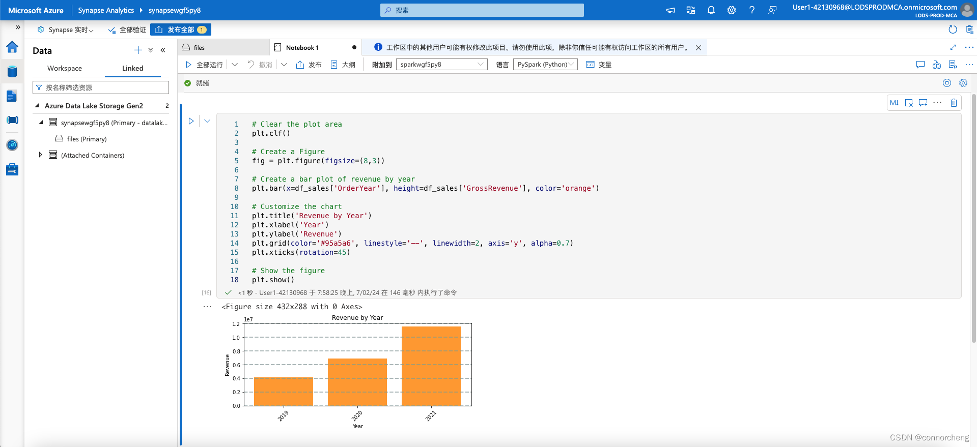
# Clear the plot area
plt.clf()

# Create a figure for 2 subplots (1 row, 2 columns)
fig, ax = plt.subplots(1, 2, figsize = (10,4))

# Create a bar plot of revenue by year on the first axis
ax[0].bar(x=df_sales['OrderYear'], height=df_sales['GrossRevenue'], color='orange')
ax[0].set_title('Revenue by Year')

# Create a pie chart of yearly order counts on the second axis
yearly_counts = df_sales['OrderYear'].value_counts()
ax[1].pie(yearly_counts)
ax[1].set_title('Orders per Year')
ax[1].legend(yearly_counts.keys().tolist())

# Add a title to the Figure
fig.suptitle('Sales Data')

# Show the figure
plt.show()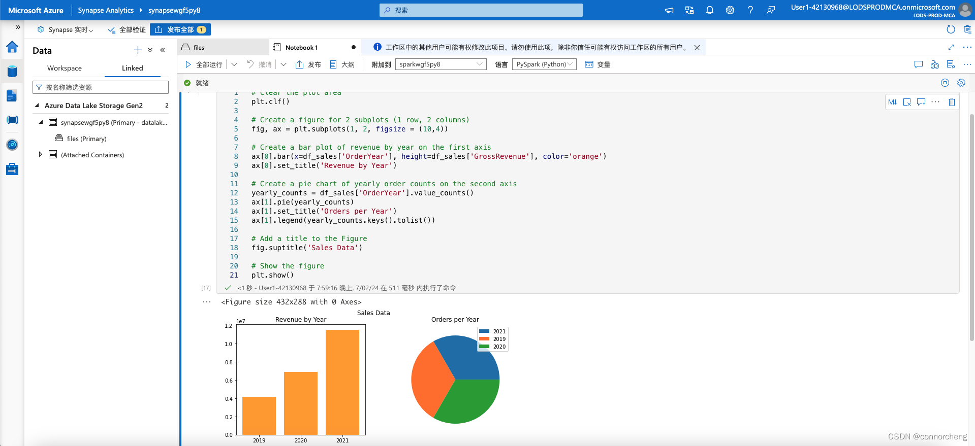
import seaborn as sns

# Clear the plot area
plt.clf()

# Create a bar chart
ax = sns.barplot(x="OrderYear", y="GrossRevenue", data=df_sales)
plt.show()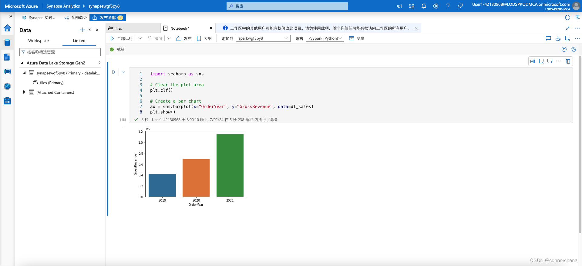
# Clear the plot area
plt.clf()

# Set the visual theme for seaborn
sns.set_theme(style="whitegrid")

# Create a bar chart
ax = sns.barplot(x="OrderYear", y="GrossRevenue", data=df_sales)
plt.show()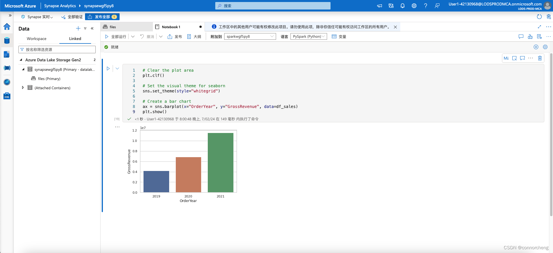
# Clear the plot area
plt.clf()

# Create a bar chart
ax = sns.lineplot(x="OrderYear", y="GrossRevenue", data=df_sales)
plt.show()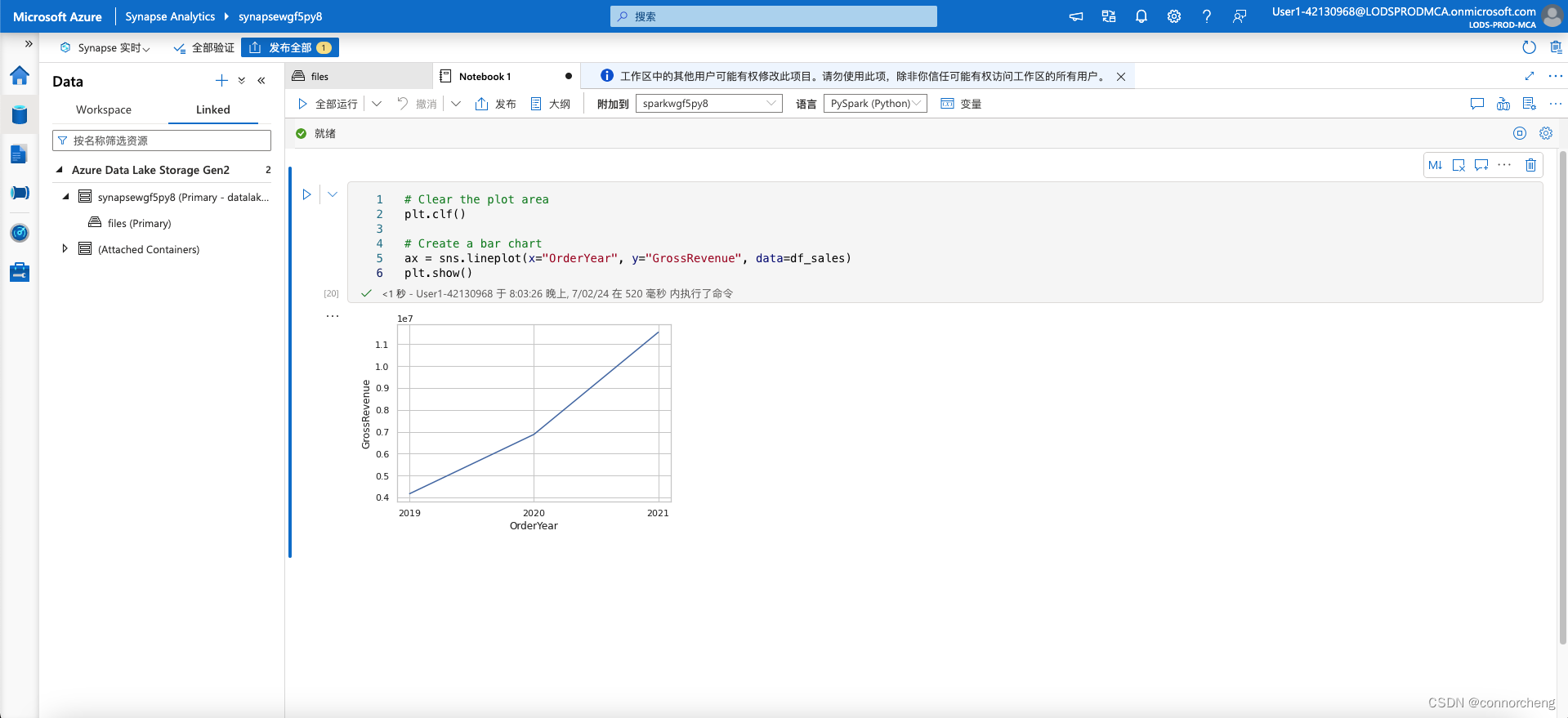
本站资源均来自互联网,仅供研究学习,禁止违法使用和商用,产生法律纠纷本站概不负责!如果侵犯了您的权益请与我们联系!
转载请注明出处: 免费源码网-免费的源码资源网站 » Synapse Spark

发表评论 取消回复