问题描述
使用echarts折线图和柱状图展示数据时,如果数据差异值较大,会导致显示图形差异过大,图表不美观。
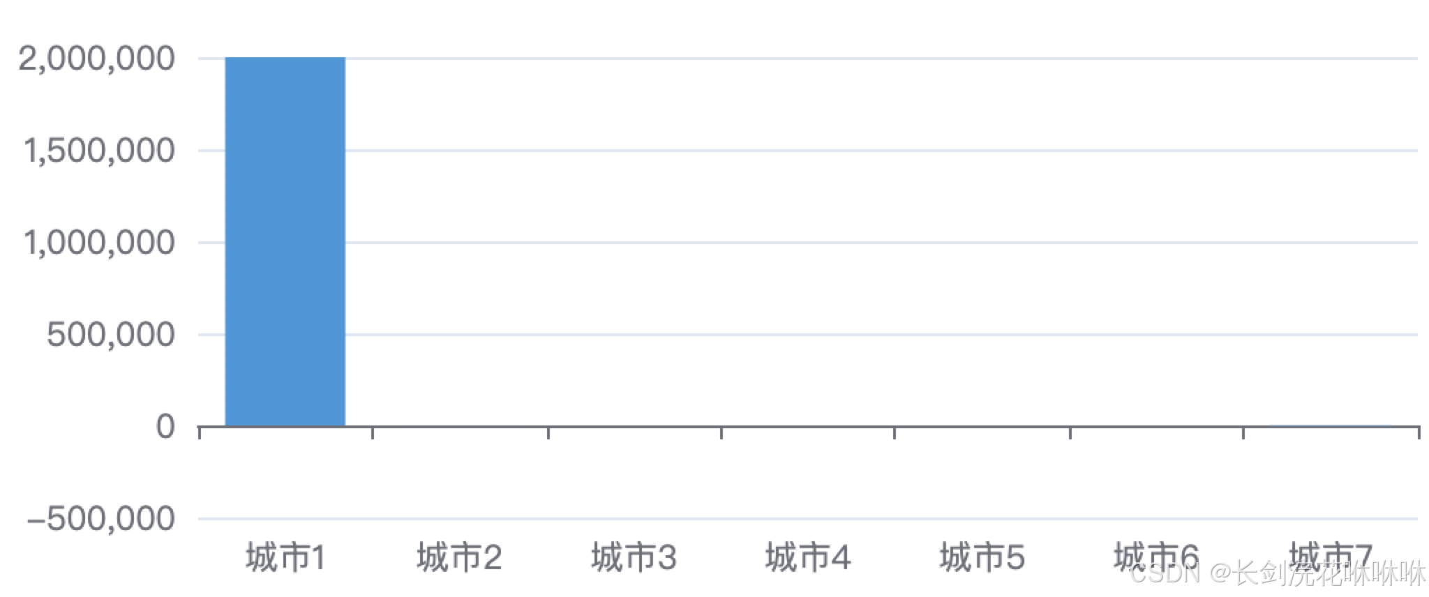
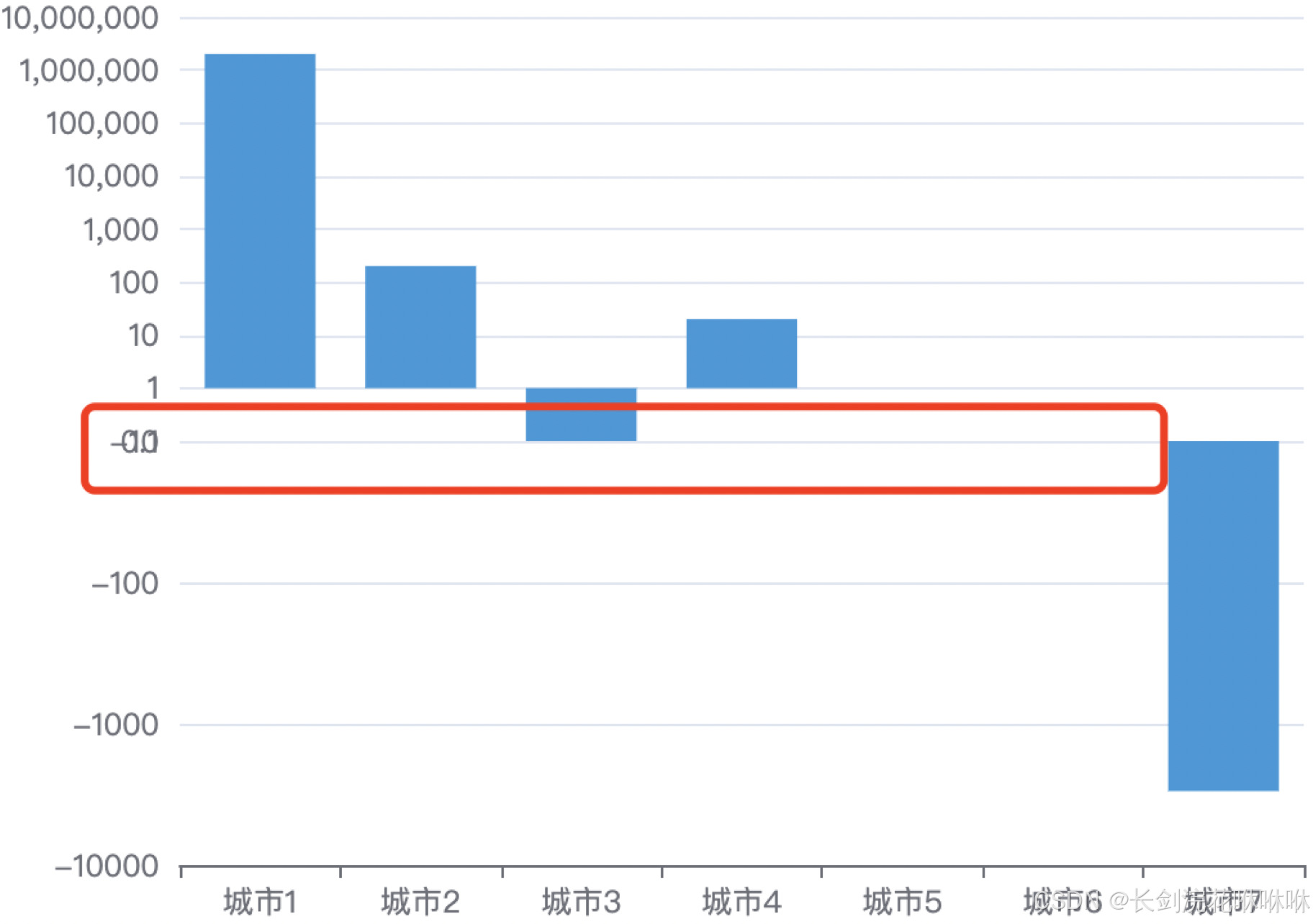
如这一组数据[2000000, 200, 0.1, 20, 0, -10, -3000],渲染出来的效果如下图:
可以看到由于最大值和最小值差异过大,导致过小的值柱子显示不出来,数据的波动趋势不明显。
当前需要解决的问题是如何体现数据差异性,让小数值柱子也能显示出来。
解决方案:
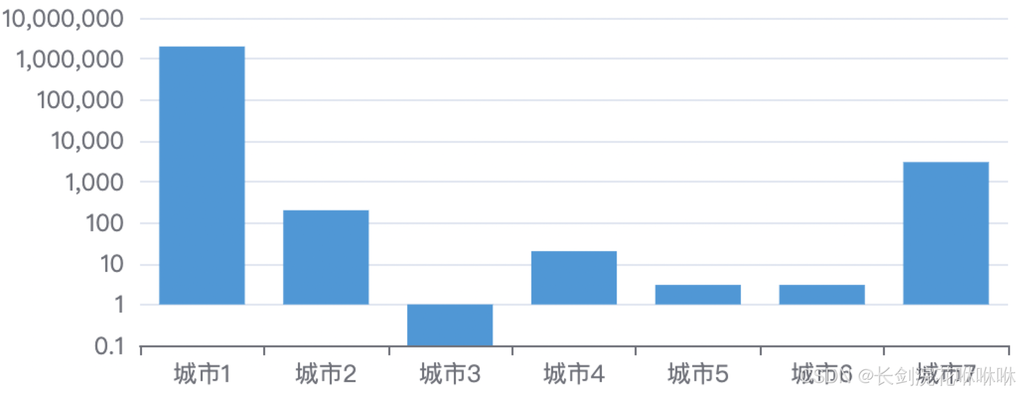
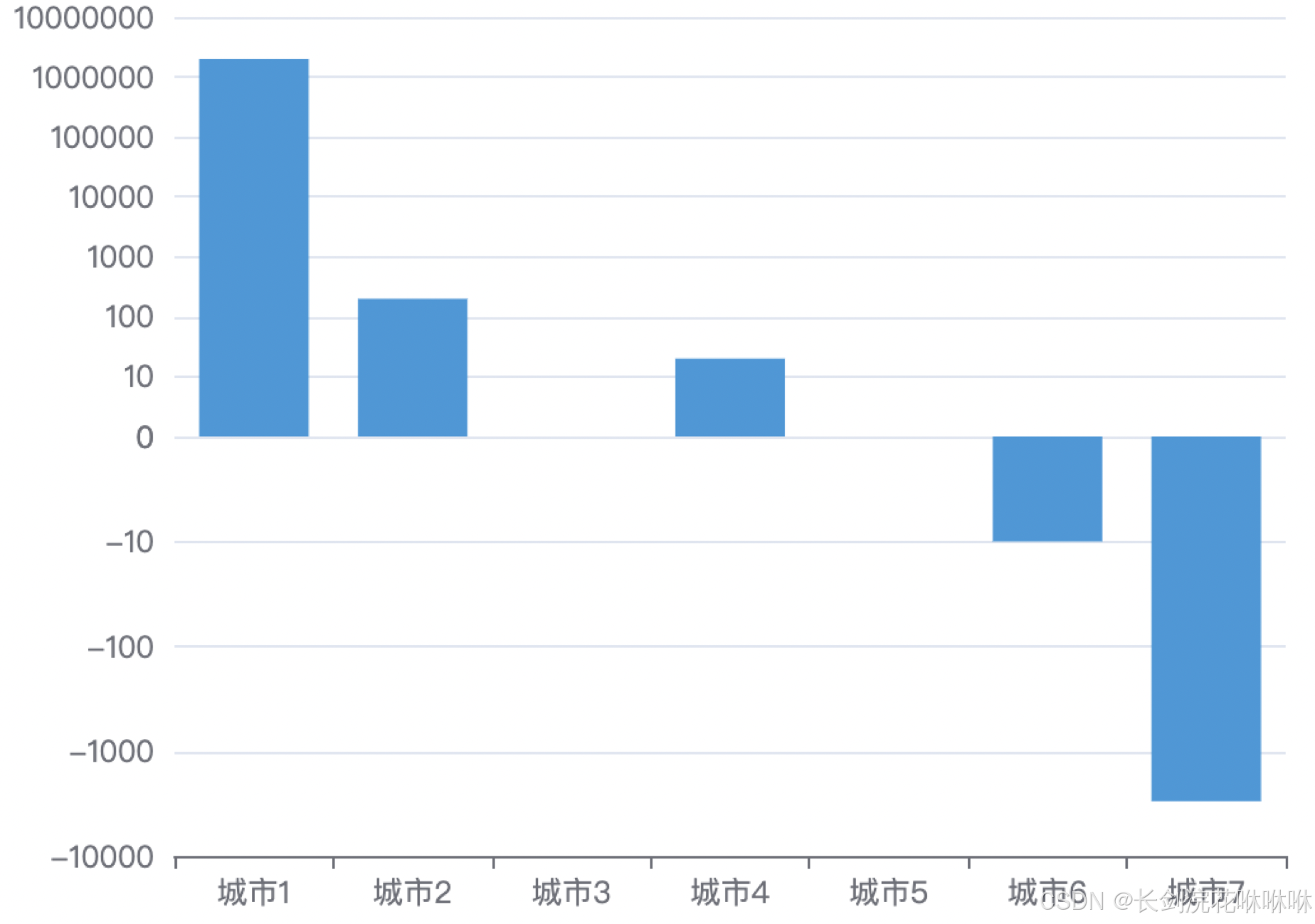
使用对数轴(yAxis. type=“log”),适用于对数数据,可以解决数据差异过大的问题。但对数轴只适用于data>=0的情况。
如数据:barDatas = [2000000, 200, 0.1, 20, 3,3, 3000]
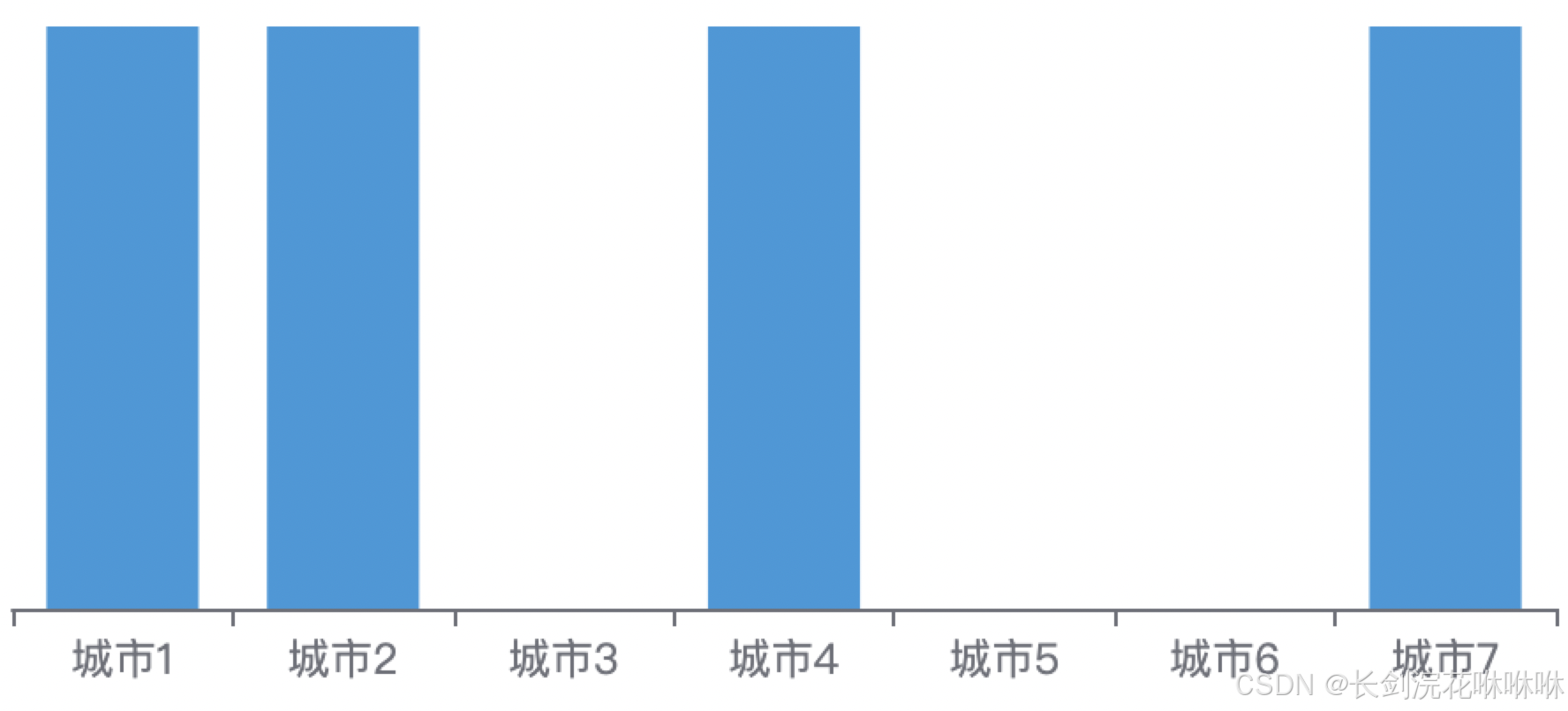
如果对数轴中的数组数据出现0或者负数情况,就会造成错误渲染。
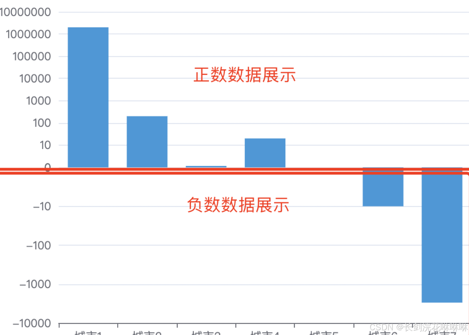
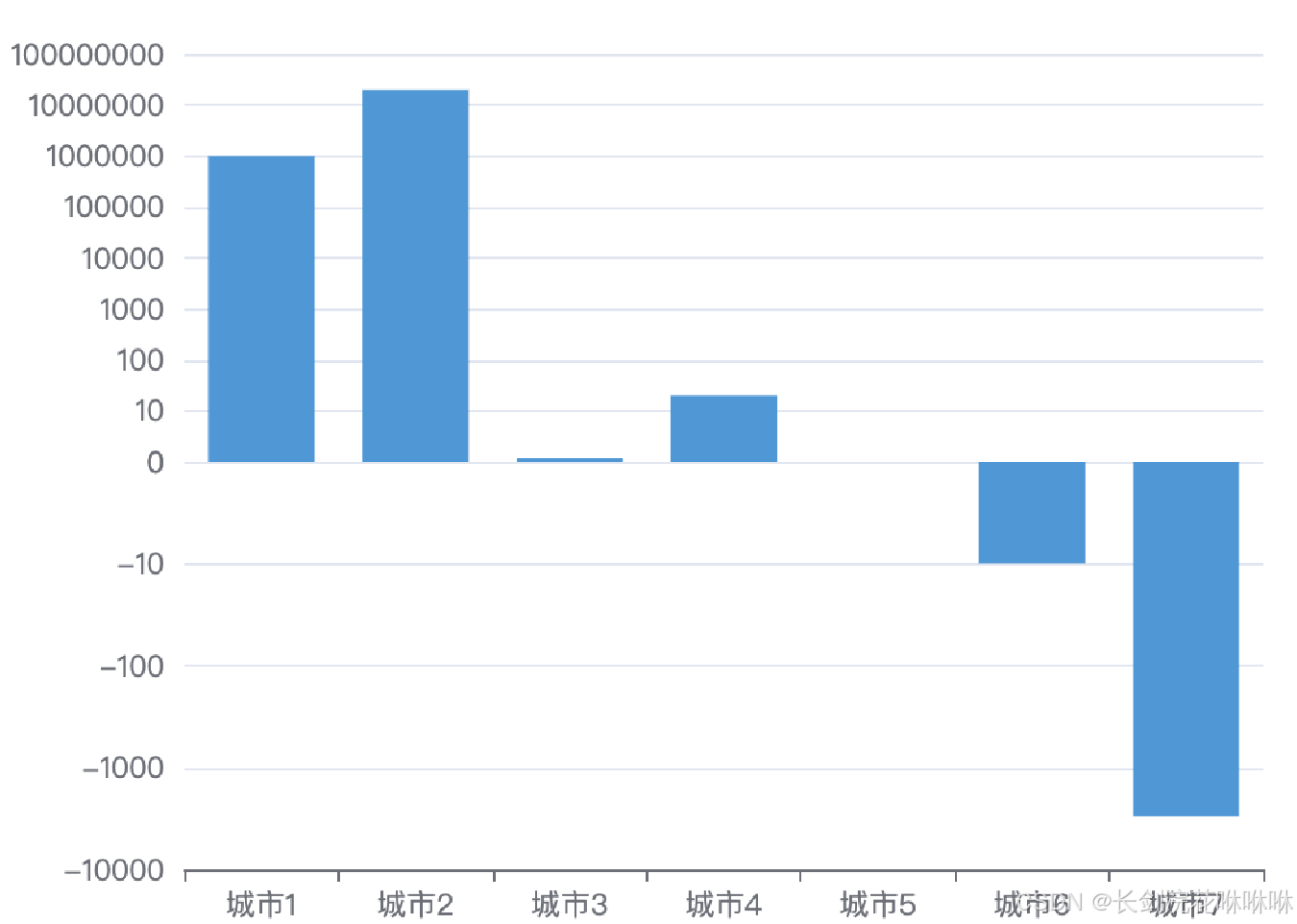
试了很多办法都无法解决这个问题,最后采取了多个grid多轴的办法。
可以通过grid来划分多个网格区域,然后让正数和负数柱状图分别在在不同的区域展现。
如:const barDatas = [2000000, 200, 0.1, 20, 0, -10, -3000]
流程展示:
-
将barDatas数组拆分为正数数组,负数数组
-
设置三个grid,分别为用于展示正数,负数数据,以及底部X轴
-
正负数数据网格区域y轴为yAxis. type=“log”,X轴网格区数数据区域yAxis. type=“value”
-
正数柱状图series.data只展示大于0的数据,其余为null(barDatas.map(item => item > 0 ? item : null);
负数柱状图series.data只展示小于0的数据,并展示为绝对值,其余为null(barDatas.map(item => item < 0 ? Math.abs(item): null) -
设置负数的y轴yAxis.inverse=true,让Y轴绕X轴上下翻转,并配置y轴标签显示yAxis.axisLabel.formatter=(val) => val === 1 ? 0 :
-${val}
其中要解决的问题是:
1)解决起始0对齐的问题
因为对数轴的数据不能为0,所以需要设置上下yAxis的min为1,再通过yAxis.axisLabel.formatter将y轴的1改为0。
2)小于1的数据柱子无高度。
需要设置barMinHeight最小高度,同时改造小于1的数为1.01
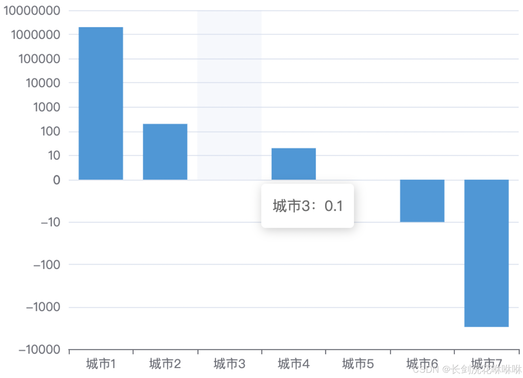
这种方式能很好的解决数据差异过大的问题。
效果图附上:
代码附上:
<!DOCTYPE html>
<html lang="en" style="height: 100%">

<head>
    <meta charset="utf-8">
</head>
<script type="text/javascript" src="https://registry.npmmirror.com/echarts/5.5.0/files/dist/echarts.min.js"></script>

<body style="height: 100%; margin: 0">
    <div id="container" style="width: 50%;height: 50%;border: 1px solid red;margin: 30px;"></div>
    <script type="text/javascript">
        var dom = document.getElementById('container');
        var myChart = echarts.init(dom, null, {
            renderer: 'canvas',
            useDirtyRect: false
        });
        var app = {};
        var option;
        // const barDatas = [1000000, 20000000, 0.1, 20, 0, -10, -3000];
        // const barDatas = [200000, -100];
        const barDatas = [2000000, 200, 0.1, 20, 0, -10, -3000]
        option = {
            color: ['#3398DB'],
            tooltip: {
                trigger: 'axis',
                axisPointer: {
                    type: 'shadow'
                },
                formatter: (params) => {
                    const { dataIndex } = params[0]
                    return `${`城市${dataIndex + 1}`}:${barDatas[dataIndex]}`
                }
            },
            grid: [{
                right: 20,
                left: 80,
                top: 30,
                bottom: '50%',
                containLabel: false,
            }, {
                right: 20,
                left: 80,
                top: '50%',
                bottom: 30,
                containLabel: false,
                show: false
            }, {
                right: 20,
                left: 80,
                top: '50%',
                bottom: 30,
                containLabel: false,
                show: false
            }],
            xAxis: [
                {
                    type: 'category',
                    gridIndex: 0,
                    show: false,
                },
                {
                    type: 'category',
                    show: false,
                    gridIndex: 1,
                },
                {
                    type: 'category',
                    interval: 0,
                    gridIndex: 2,
                    data: barDatas.map((item, index) => `城市${index + 1}`)
                },
            ],
            yAxis: [
                {
                    type: 'log',
                    gridIndex: 0,
                    min: 1, // 设置y轴最小值
                    axisLabel: {
                        formatter: (val) => val === 1 ? 0 : val
                    }
                },
                {
                    type: 'log',
                    gridIndex: 1,
                    inverse: true, //设置反向坐标,让Y轴绕X轴上下翻转
                    min: 1, // 设置y轴最小值
                    axisLabel: {
                        formatter: (val) => val === 1 ? 0 : `-${val}`
                    }
                },
                {
                    type: 'value',
                    gridIndex: 2,
                    show: false,
                },
            ],
            series: [
                {
                    name: '正数',
                    xAxisIndex: 0,
                    yAxisIndex: 0,
                    type: 'bar',
                    data: barDatas.map(item => item > 0 ? item > 1 ? item : 1.01 : null), // 正数柱状图series.data只展示大于0的数据
                    barMinHeight: 1.5,// 最小高度
                },
                {
                    name: '负数',
                    type: 'bar',
                    xAxisIndex: 1,
                    yAxisIndex: 1,
                    data: barDatas.map(item => item < 0 ? Math.abs(item) > 1 ? Math.abs(item) : 1.01 : null), // 负数柱状图eries.data只展示小于0的数据
                    barMinHeight: 1.5, // 最小高度
                },
                {
                    name: 'x轴',
                    xAxisIndex: 2,
                    yAxisIndex: 2,
                    type: 'bar',
                    show: false,
                    data: barDatas.map(item => null),
                },
            ],
        };
        if (option && typeof option === 'object') {
            myChart.setOption(option);
        }
        window.addEventListener('resize', myChart.resize);
    </script>
</body>

</html>
本站资源均来自互联网,仅供研究学习,禁止违法使用和商用,产生法律纠纷本站概不负责!如果侵犯了您的权益请与我们联系!
转载请注明出处: 免费源码网-免费的源码资源网站 » echarts解决数据差异过大的问题

发表评论 取消回复