前言
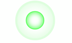
CSS雷达光波效果是一种视觉动画效果,常用于模仿雷达扫描或检测的视觉反馈。这种效果通常涉及到动态的圆形或弧形图案,它们从一个中心点向外扩散,类似于水面上的涟漪或雷达扫描线。以下是创建CSS雷达光波效果的一些关键技术和步骤,这里提供两种效果 ,简单记录一下
一. First
1. HTML 结构
<div class="radar_container">
      <div class="radar_wave"></div>
      <div class="radar_wave"></div>
      <div class="radar_wave"></div>
</div>
2. CSS 内容
  .radar_container {
    margin: auto;
    position: relative;
    width: 200px;
    height: 200px;
    // background-color: #000;
    border-radius: 50%;
    overflow: hidden;
    cursor: pointer;
    display: flex;
    align-items: center;
    justify-content: center;
  }

  .radar_wave {
    position: absolute;
    width: 20px;
    height: 20px;
    border: 1px solid #00ff00;
    border-radius: 50%;
    transform: scale(0); // 初始状态改为从中间开始
    box-shadow: inset 0 0 5px 1px #00ff00; // 添加阴影
    animation: radar_wave-animation 3s infinite;
  }

  .radar_wave:nth-child(1) {
    animation-delay: 0s;
  }
  .radar_wave:nth-child(2) {
    animation-delay: 1s;
  }
  .radar_wave:nth-child(3) {
    animation-delay: 2s;
  }

  @keyframes radar_wave-animation {
    0% {
      transform: scale(0); // 从中间开始
      opacity: 1;
    }
    100% {
      transform: scale(10); // 扩散到原来的10倍大小
      opacity: 0;
    }
  }
二. Second
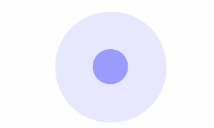
1. HTML 结构同上,CSS 内容请看以下
  .radar_container {
    margin: auto;
    position: relative;
    width: 200px;
    height: 200px;
    // background-color: #000;
    border-radius: 50%;
    overflow: hidden;
    cursor: pointer;
  }
  .radar_wave {
    position: absolute;
    top: 50%;
    left: 50%;
    width: 20px;
    height: 20px;
    background-color: #8080ff;
    border-radius: 50%;
    transform: translate(-50%, -50%) scale(1);
    animation: radar_wave-animation 3s infinite;
  }

  .radar_wave:nth-child(1) {
    animation-delay: 0s;
  }

  .radar_wave:nth-child(2) {
    animation-delay: 1s;
  }

  .radar_wave:nth-child(3) {
    animation-delay: 2s;
  }

  @keyframes radar_wave-animation {
    0% {
      transform: scale(0); // 从中间开始
      opacity: 1;
    }
    100% {
      transform: scale(10); // 扩散到原来的10倍大小
      opacity: 0;
    }
  }
感觉有用,就一键三连,感谢(●'◡'●)
本站资源均来自互联网,仅供研究学习,禁止违法使用和商用,产生法律纠纷本站概不负责!如果侵犯了您的权益请与我们联系!
转载请注明出处: 免费源码网-免费的源码资源网站 » CSS雷达光波效果(前端雷达光波效果)

发表评论 取消回复