界面分析:
由于整体UX设计图符合从上至下的布局,所以可以采用Column组件作为外层容器
简介:
- 最上方的标题可以使用Text组件进行加载渲染
- 中间的Banner图和简介分别可以使用Image组件和Text组件进行加载
- 最后一部分可以看作是一个列表,它由若干个列表项ListItem构成
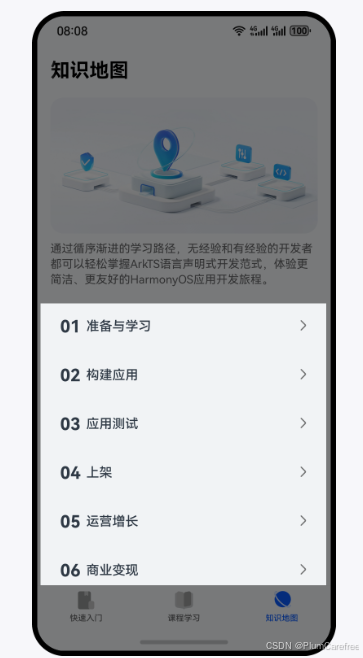
实现标题、Banner、简介:
- 标题栏可以采用Text组件进行加载渲染
1. Column() {
2. Text('标题')
3. .fontFamily('HarmonyHeiTi-Bold')
4. .fontSize(24)
5. .fontColor(Color.Black)
6. .textAlign(TextAlign.Start)
7. .lineHeight(33)
8. .fontWeight(700)
9. .width('100%')
10. }
11. .padding({ top: 12, right: 16, bottom: 12, left: 16})
12. .backgroundColor('#F1F3F5')
- 放入图片资源:./src/main/resources/base/media目录中
- 使用Image组件加载放入的Banner图片,设置其宽度百分百,并设置圆角。同时注意到banner图与上方的title间有19单位的空隙,与下方的组件有8单位的空隙
1. Image($r('app.media.yourpicture'))
2. .width('100%')
3. .borderRadius(16)
4. .margin({ top: 19, bottom: 8 })
- 简介的部分也可以采用Text组件来进行数据的渲染
1. Text('简介')
2. .fontFamily('HarmonyHeiTi')
3. .fontSize(14)
4. .fontColor('rgba(0,0,0,0.60)')
5. .fontWeight(400)
6. .textAlign(TextAlign.Start)
- 实现List的列表项
// @Component功能更加多样,有自己的生命周期,还能支持预览效果
// 而@Builder更加轻量,能满足基础的组件封装,性能更好,但是不支持预览

1. @Component
2. export struct Item {
3. build() {
4. Row(){

6. }
7. .width('100%')
8. .height(48)
9. .borderRadius(16)
10. .alignItems(VerticalAlign.Center)
11. .padding({ left: 12, right: 12 })
12. .backgroundColor('#F1F3F5')
13. }
14. }
- 导出数据接口
1. export struct Item {
2. @State navBarItem: NavBarItemType = {
3. order: '01',
4. title: '标题'
5. };
6. ...
7. }
- 实现序号
1. @Component
2. export struct Item {
3. ...

5. build() {
6. Row() {
7. Text(this.navBarItem.order)
8. .margin({ right: 6 })
9. .fontFamily('HarmonyHeiTi-Bold')
10. .fontSize(21)
11. .fontColor('#182431')
12. .textAlign(TextAlign.Start)
13. .lineHeight(22)
14. .fontWeight(700)
15. }
16. ...
17. }
18. }
- 实现标题
1. @Component
2. export struct Item {
3. ...

5. build() {
6. Row() {
7. Text(this.navBarItem.order)
8. ...
9. Text(this.navBarItem.title)
10. .fontFamily('HarmonyHeiTi-Medium')
11. .fontSize(16)
12. .fontColor('#182431')
13. .textAlign(TextAlign.Start)
14. .lineHeight(22)
15. .fontWeight(500)
16. }

18. }
19. }
- 将指向下一页的图标放置于 ./src/main/resources/base/media目录下,并填充
1. @Component
2. export struct Item {
3. ...

5. build() {
6. Row() {
7. Text(this.navBarItem.order)
8. ...
9. Text(this.navBarItem.title)
10. ...
11. Blank()
12. Image($r('app.media.ic_arrow'))
13. .width(12)
14. .height(24)
15. }
16. ...
17. }
18. }
组合列表项:
- 定义数据集,在分栏Tab的首页进行定义
1. @State navBarList: NavBarItemType[] = [
2. { order: '01', title: '准备与学习' },
3. { order: '02', title: '构建应用' },
4. { order: '03', title: '应用测试' },
5. { order: '04', title: '上架' },
6. { order: '05', title: '运营增长' },
7. { order: '06', title: '商业变现' },
8. { order: '07', title: '更多' }
9. ];
- 循环渲染
1. List({ space: 12 }) {
2. ForEach(this.navBarList, (item: NavBarItemType, index: number) => {
3. ListItem() {
4. NavBarItem({ navBarItem: item })
5. }
6. .width('100%')
7. }, (item: NavBarItemType): string => item.title)
8. }
9. .width('100%')
10. .margin({ top: 24 })
- 在build()函数中,加入Scroll组件。可以解决当内容条数不足时,Scroll组件滚动时会出现空白区域的错误效果。edgeEffect用于设置边缘滑动效果,设置为EdgeEffect.Spring表示设置为弹性物理动效
本站资源均来自互联网,仅供研究学习,禁止违法使用和商用,产生法律纠纷本站概不负责!如果侵犯了您的权益请与我们联系!
转载请注明出处: 免费源码网-免费的源码资源网站 » HarmonyOS 用List组件实现组合列表项

发表评论 取消回复