一、Styling Your App
The examples in the previous section used Dash HTML Components to build a simple app layout, but you can style your app to look more professional. This section will give a brief overview of the multiple tools that you can use to enhance the layout style of a Dash app:
- HTML and CSS
- Dash Design kit (DDK)
- Dash Bootstrap Components
- Dash Mantine Components
二、Dash Bootstrap Components
Dash Bootstrap is a community-maintained library built off of the bootstrap component system. Although it is not officially maintained or supported by Plotly, Dash Bootstrap is a powerful way of building elegant app layouts. Notice that we first define a row and then the width of columns inside the row, using the dbc.Row and dbc.Col components.
For the app below to run successfully, make sure to install the Dash Bootstrap Components library: pip install dash-bootstrap-components.
# Import packages
from dash import Dash, html, dash_table, dcc, callback, Output, Input
import pandas as pd
import plotly.express as px
import dash_bootstrap_components as dbc
# Incorporate data
df = pd.read_csv('https://raw.githubusercontent.com/plotly/datasets/master/gapminder2007.csv')
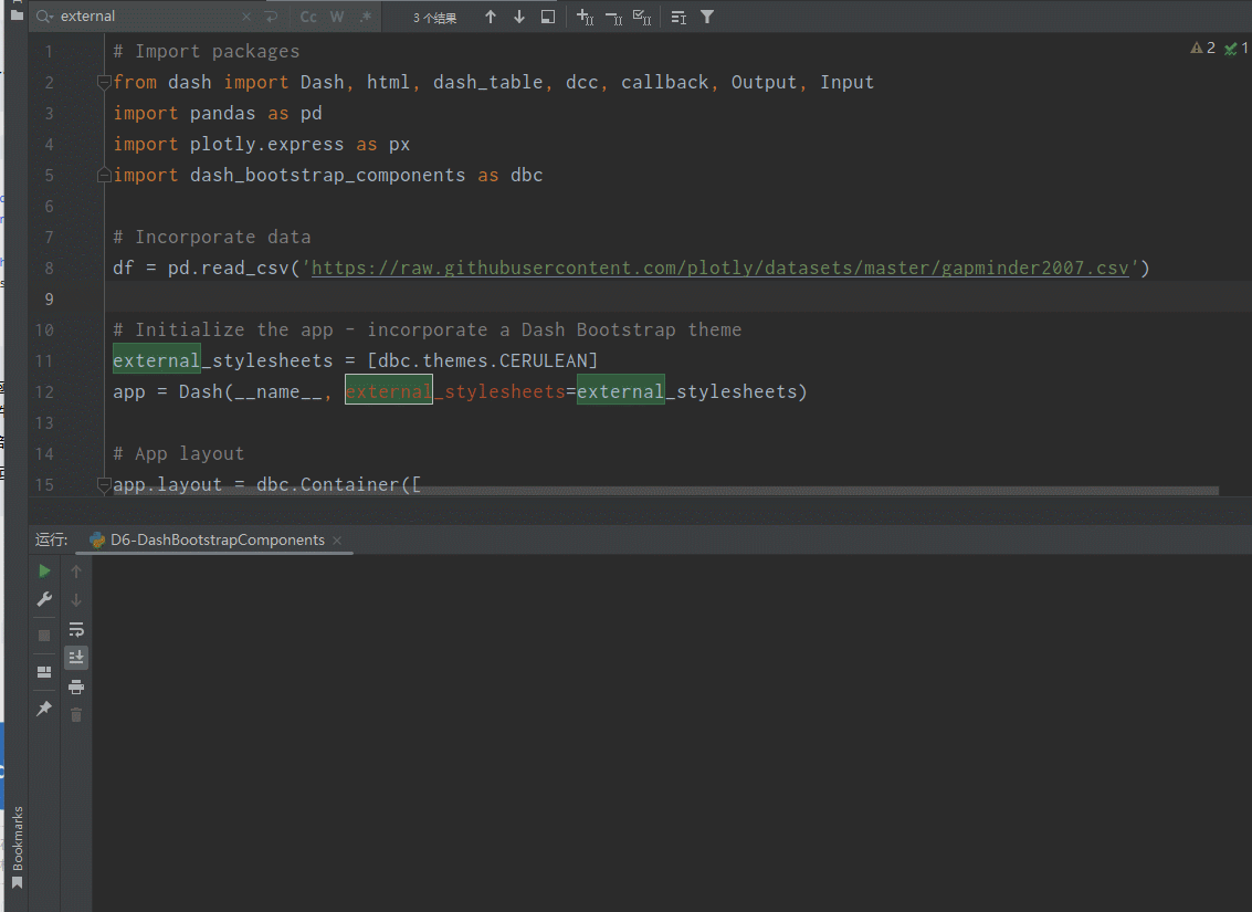
# Initialize the app - incorporate a Dash Bootstrap theme
external_stylesheets = [dbc.themes.CERULEAN]
app = Dash(__name__, external_stylesheets=external_stylesheets)
# App layout
app.layout = dbc.Container([
dbc.Row([
html.Div('My First App with Data, Graph, and Controls', className='text-primary text-center fs-3')
]),
dbc.Row([
dbc.RadioItems(options=[{'label': x, 'value': x} for x in ['pop', 'lifeExp', 'gdpPercap']],
value='lifeExp',
inline=True,
id='radio-buttons-final')
]),
dbc.Row([
dbc.Col([
dash_table.DataTable(data=df.to_dict('records'), page_size=12, style_table={'overflowX': 'auto'})
], width=6),
dbc.Col([
dcc.Graph(figure={}, id='my-first-graph-final')
], width=6),
]),
], fluid=True)
# Add controls to build the interaction
@callback(
Output(component_id='my-first-graph-final', component_property='figure'),
Input(component_id='radio-buttons-final', component_property='value')
)
def update_graph(col_chosen):
fig = px.histogram(df, x='continent', y=col_chosen, histfunc='avg')
return fig
# Run the app
if __name__ == '__main__':
app.run(debug=True)
三、解读
Dash Bootstrap Components 是 Dash 的一个拓展包,提供了一组预定义的 Bootstrap 样式组件。
# Import packages
from dash import Dash, html, dash_table, dcc, callback, Output, Input
import pandas as pd
import plotly.express as px
import dash_bootstrap_components as dbc
- 导入Python 库。Dash 用于创建 Web 应用,pandas 用于数据处理,plotly.express 用于创建图表,dash_bootstrap_component 用于提供 Bootstrap 样式的组件。
# Incoporate data
df = pd.read_csv('https://raw.githubusercontent.com/plotly/datasets/master/gapminder2007.csv')
- 使用 pandas 的 read_csv 函数从URL 数据文件中加载数据到 DataFrame df。
# Initialize the app - incorporate a Dash Bootstrap theme
external_stylesheets = [dbc.theme.CERULEAN]
app = Dash(__name__, external_stylesheets=external_stylesheets)
- 初始化 Dash 应用并设置外部样式表,这里使用了 Dash Bootstrap Component 的 CERULEAN 主题(天蓝色主题)
# App layout
app.layout = dbc.Container([
        #...
], fluid=True)
- 定义应用的布局,使用 dbc.Container 作为根容器
- fluid=True 使容器宽度自适应屏幕宽度。
dbc.Row([
    html.Div('My First App with Data, Graph, and Controls', className='text-primary text-center fs-3')
]),
- 创建一个 dbc.Row 容器,包含一个 html.Div 组件,显示应用的标题。
dbc.Row([
    dbc.RadioItems(options=[{'label': x, 'value': x} for x in ['pop', 'lifeExp', 'gdpPercap']], value='lifeExp', inline=True, id='radio-buttons-final')
]),
- 创建一个 dbc.Row 容器,包含 dbc.RadioItems 组件,用于创建一组单选按钮,选项为['pop', 'lifeExp', 'gdpPercap']。
dbc.Row([
    dbc.Col([
        dash_table.DataTable(data=df.to_dict('records'), page_size=12, style_table={'overflowX': 'auto'})
        ], width=6),
    dbc.Col([
        dcc.Graph(figure={}, id='my-first-graph-final')
    ], width=6),
]),
- 创建一个 dbc.Row 容器,包含两个 dbc.Col 组件,分别占据 6 列宽度。
- 第一个 dbc.Col 包含 dash_table.DataTable 组件,用于显示数据表
- 第二个 dbc.Col 包含 dcc.Graph 组件,用于显示图表
@callback(
    Output(component_id='my-first-graph-final', component_property='figure'),
    Input(component_id='radio-buttons-final', component_property='value')
)
def update_graph(col_chosen):
    fig = px.histogram(df, x='continent', y=col_chosen, histfunc='avg')
    return fig
)
- 定义一个回调函数 update_graph,它根据 dbc.RadioItems 组件的选中值动态更新 dcc.Graph 组件的图表。
- 在回调函数内部,使用 plotly.express 的 px.histogram 创建一个直方图。
- 从回调函数返回图表对象 fig,Dash 将使用这个对象更新图表组件。
本站资源均来自互联网,仅供研究学习,禁止违法使用和商用,产生法律纠纷本站概不负责!如果侵犯了您的权益请与我们联系!
转载请注明出处: 免费源码网-免费的源码资源网站 » 【Dash】使用 Bootstrap Componnet 创建图表

发表评论 取消回复