元素居中的方法
.父元素{
    position:relative;
    .子元素{
        left:0;
        right:0;
        margin:auto;
        width: fit-content;//随内容变化设置宽度

}
}
<template>
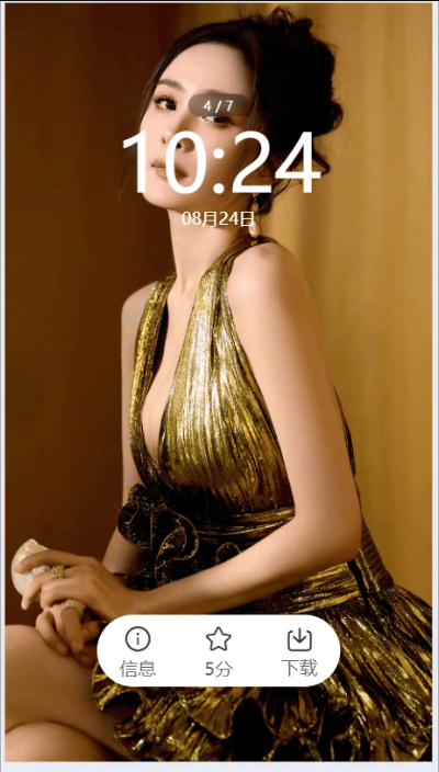
<view class="lockScreen" @click="maskChange">
<swiper circular>
<swiper-item v-for="(item,index) in 6" :key="index">
<image src="../../common/images/preview2.jpg" mode="aspectFill"></image>
</swiper-item>
</swiper>
<view class="mask" v-show="maskState">
<view class="goBack"></view>
<view class="count">4 / 7</view>
<view class="time">
<uni-dateformat :date="new Date()" format="hh:mm"></uni-dateformat>
</view>
<view class="date">
<uni-dateformat :date="new Date()" format="MM月dd日"></uni-dateformat>
</view>
<view class="footer">
<view class="box">
<uni-icons type="info" size="30"></uni-icons>
<text class="typeface">信息</text>
</view>
<view class="box">
<uni-icons type="star" size="30"></uni-icons>
<text class="typeface">5分</text>
</view>
<view class="box">
<uni-icons type="download" size="28"></uni-icons>
<text class="typeface">下载</text>
</view>
</view>
</view>
</view>
</template>
<script setup>
import { ref } from 'vue';
import { onShow } from "@dcloudio/uni-app";
// 显示与隐藏
const maskState =ref(true)
const maskChange =()=>{
maskState.value=!maskState.value
}
</script>
<style lang="scss" scoped>
.lockScreen{
width: 100%;
height: 100vh;
position: relative;
swiper{
width: 100%;
height: 100%;
swiper-item{
image{
width: 100%;
height: 100%;
}
}
}
.mask{
// 父级紧邻的子元素公用属性
&>view{
position: absolute;
left:0;
margin: auto;
right: 0;
width: fit-content;//随内容变化设置宽度
color:#fff;
}
.goBack{
}
.count{
top:12vh;
background: rgba(0,0,0,0.3);
border-radius: 40rpx;
font-size: 24rpx;
padding: 4rpx 28rpx;
backdrop-filter: blur(10rpx);//设置模糊
}
.time{
font-size: 140rpx;
top:calc( 10vh + 50rpx);
}
.date{
font-size: 30rpx;
top:calc(10vh + 225rpx);
}
.footer{
bottom: 10vh;
display: flex;
justify-content: space-between;
background-color: #fff;
height: 125rpx;
border-radius:125rpx;
.box{
display: flex;
flex-direction: column;
align-items: center;
padding:0 30rpx;
justify-content: center;
margin-left: 10rpx;
margin-right: 10rpx;
.typeface{
color: $text-font-color-2;
}
}
}
}
}
</style>
本站资源均来自互联网,仅供研究学习,禁止违法使用和商用,产生法律纠纷本站概不负责!如果侵犯了您的权益请与我们联系!
转载请注明出处: 免费源码网-免费的源码资源网站 » uniapp的锁屏上文字的显示与隐藏

发表评论 取消回复