使用场景
项目中,在某个按钮的右上角添加数字气泡是一个很常见的功能,可以用新建一个组合类来实现。不过这样比较麻烦,如果加气泡是后面的需求,可能改动的地方较多。
下面介绍2种比较简单,不需要改动按钮响应的方式。
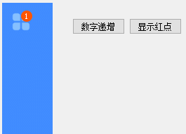
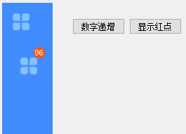
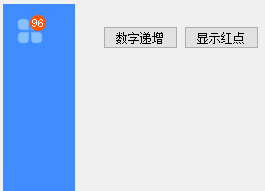
实现效果图
方案1
方案2
实现
方案1:直接在按钮内部贴一个 QLabel
这种情况按钮不能太小,按钮的图片不能占整个按钮最好不要太满。不然效果不理想。
#pragma once

#include <QtWidgets/QWidget>
#include "ui_pafeyDemo.h"
#include <QLabel>

class pafeyDemo : public QWidget
{
	Q_OBJECT

public:
	pafeyDemo(QWidget *parent = Q_NULLPTR);

private:
	Ui::pafeyDemoClass ui;

	QLabel *m_pLabelToolRed;
};
#include "pafeyDemo.h"

pafeyDemo::pafeyDemo(QWidget *parent)
	: QWidget(parent)
{
	ui.setupUi(this);
	m_pLabelToolRed = 0;

	connect(ui.pushButtonShow,&QPushButton::clicked,this, [=](){
		if (0 == m_pLabelToolRed)
		{
			m_pLabelToolRed = new QLabel(ui.btTool);
			m_pLabelToolRed->setObjectName("btToolNew"); // 设置子控件的对象名
			m_pLabelToolRed->setFixedSize(16, 16); // 设置小圆点大小
			//m_pLabelToolRed->setStyleSheet("background-color: rgba(255, 255, 255, 0);border-image: url(:/pafeyDemo/Resources/bar/bar_new.png);"); // 设置小圆点样式
			m_pLabelToolRed->setStyleSheet("QLabel{background-color: rgb(255, 85, 0);color: rgb(255, 255, 255);border-radius:8px}"); // 设置小圆点样式
			m_pLabelToolRed->move(ui.btTool->width() - 16, 0); // 将小圆点移动到右上角
			m_pLabelToolRed->setText("96");
			m_pLabelToolRed->setAlignment(Qt::AlignHCenter | Qt::AlignVCenter);
		}
		m_pLabelToolRed->show();
	});
	connect(ui.pushButtonHide, &QPushButton::clicked, this, [=]() {
		m_pLabelToolRed->hide();
	});
	connect(ui.pushButtonNum, &QPushButton::clicked, this, [=]() {
		int num = m_pLabelToolRed->text().toInt()+1;
		if (num>99)
		{
			m_pLabelToolRed->setFixedSize(22, 16); // 设置小圆点大小
			m_pLabelToolRed->move(ui.btTool->width() - 22, 0); // 将小圆点移动到右上角
			m_pLabelToolRed->setText(QString("99+"));
		}
		else
		{
			m_pLabelToolRed->setText(QString::number(num));
		}
	});

}
要注意的是,红色气泡 QLabel 的长宽动态决定了 border-radius: 8px 的值,radius是长宽一半。
如果气泡的数字超过99,需要显示 99+ 的时候,可以加大 QLabel 的宽度。
我这个按钮比较小,99+的时候就挡住按钮本身比较多了。
效果不理想,那就可以用另一方案了。
方案2:把按钮放在一个 QWidget 里面,再把气泡 QLabel 放在Qwidget 上。
#include "pafeyDemo.h"

pafeyDemo::pafeyDemo(QWidget *parent)
	: QWidget(parent)
{
	ui.setupUi(this);
	m_pLabelToolRed = 0;

	ui.widgetBubble->setFixedSize(50,50);

	connect(ui.pushButtonShow,&QPushButton::clicked,this, [=](){
		if (0 == m_pLabelToolRed)
		{
			//m_pLabelToolRed = new QLabel(ui.btTool);
			m_pLabelToolRed = new QLabel(ui.widgetBubble);
			m_pLabelToolRed->setObjectName("btToolNew"); // 设置子控件的对象名
			m_pLabelToolRed->setFixedSize(16, 16); // 设置小圆点大小
			//m_pLabelToolRed->setStyleSheet("background-color: rgba(255, 255, 255, 0);border-image: url(:/pafeyDemo/Resources/bar/bar_new.png);"); // 设置小圆点样式
			m_pLabelToolRed->setStyleSheet("QLabel{background-color: rgb(255, 85, 0);color: rgb(255, 255, 255);border-radius:8px}"); // 设置小圆点样式
			//m_pLabelToolRed->move(ui.btTool->width() - 16, 0); // 将小圆点移动到右上角
			m_pLabelToolRed->move(ui.widgetBubble->width() - 16, 0); // 将小圆点移动到右上角
			m_pLabelToolRed->setText("96");
			m_pLabelToolRed->setAlignment(Qt::AlignHCenter | Qt::AlignVCenter);
		}
		m_pLabelToolRed->show();
	});
	connect(ui.pushButtonHide, &QPushButton::clicked, this, [=]() {
		m_pLabelToolRed->hide();
	});
	connect(ui.pushButtonNum, &QPushButton::clicked, this, [=]() {
		int num = m_pLabelToolRed->text().toInt()+1;
		if (num > 99)
		{
			m_pLabelToolRed->setFixedSize(22, 16); // 设置小圆点大小
			//m_pLabelToolRed->move(ui.btTool->width() - 22, 0); // 将小圆点移动到右上角
			m_pLabelToolRed->move(ui.widgetBubble->width() - 22, 0); // 将小圆点移动到右上角
			m_pLabelToolRed->setText(QString("99+"));
		}
		else
		{
			m_pLabelToolRed->setText(QString::number(num));
		}
	});


}
其实就是把 QLabel 的父句柄改为 QWidget 即可。
原来的按钮放在 QWidget 中间,气泡放在 QWidget 的右上角。
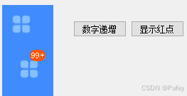
如果想让气泡压住图标一点可以再调整一下纵坐标。
本站资源均来自互联网,仅供研究学习,禁止违法使用和商用,产生法律纠纷本站概不负责!如果侵犯了您的权益请与我们联系!
转载请注明出处: 免费源码网-免费的源码资源网站 » Qt QPushButton 按钮添加数字气泡

发表评论 取消回复